The Gang of Five
The forum will have some maintenance done in the next couple of months. We have also made a decision concerning AI art in the art section.


Please see this post for more details.

Fanart by LeventeII

LeventeII · 133 · 22792

Sneak

  • Guiding lights
  • Member+
  • Cera
  • *
    • Posts: 5131
  • Welcoming darkness
    • View Profile
    • Submachine series
Like it! You made beautiful colors!

By the way - our guests from Beyond the Mysteriuos Beyond didn't break time and space and appeared in original movie here? Is it Littlefoot with Grandma/Grandpa, not with his mother? :D
6/14
0/26

--------------------------

ask me thread: http://www.gangoffive.net/index.php?topic=15601
my personal thread: http://www.gangoffive.net/index.php?topic=15412


Flathead770

  • Member+
  • Cera
  • *
    • Posts: 3136
    • View Profile
Both rainbow faces have been drawn really well here. The background is fairly simple but the colouring is pretty good. Also is it just me or is there a bit of shading done on the right side of the left rainbow face? One issue I potentially see with the colouring is that grandpa longneck and the shaded part of the mountain seem to blend together, especially around the neck and head.

Great job and congratulations on your 100th post! :celebrate


Sovereign

  • Member+
  • Ducky
  • *
    • Posts: 1940
    • View Profile
This drawing is certainly a good one as the characters are drawn pretty excellently. The expressions are done quite faithfully as they always are in your art. I agree that the coloring is quite cool, especially with the cliffs. However, I feel like the rainbowfaces could have had starker colors to make them stand out more from the background. Also, Littlefoot's details are pretty vague but his small focus here justifies that oversight. :p In any case, this drawing is another great offering from you and I'll look forward to seeing your next drawing! :yes


LeventeII

  • Member+
  • Spike
  • *
    • Posts: 265
    • View Profile
Quote
By the way - our guests from Beyond the Mysteriuos Beyond didn't break time and space and appeared in original movie here? Is it Littlefoot with Grandma/Grandpa, not with his mother? :D
It's actually just a copied scenery, nothing of my own. But that doesn't have to mean you're wrong. ;)

Quote
Also is it just me or is there a bit of shading done on the right side of the left rainbow face? One issue I potentially see with the colouring is that grandpa longneck and the shaded part of the mountain seem to blend together, especially around the neck and head.
I didn't think the shadows in this picture were important. There were only very few, so I preferred not to use them. With the mountains, however, I wanted to keep the shadows so that they would be better visible.
As for grandpa longneck, I have to agree with you. Now, with hindsight, I also realize that it seems to blend.

Quote
However, I feel like the rainbowfaces could have had starker colors to make them stand out more from the background. Also, Littlefoot's details are pretty vague but his small focus here justifies that oversight.
I agree with you that the characters need some more color. I tried to make it better in my next picture.
The lack of detail is because Littlefoot and his grandfather are quite small in this picture. I had the same problem with the face of the sharptooth in the picture with Ducky as bait.


And many thanks again for the feedback! I tried to improve the next picture a bit. :)
The following scenery was invented by myself this time, but I took several screenshots from Land Before Time as help.

Coloring took the longest time. As used to, I traced the contours of the characters with a black pencil.


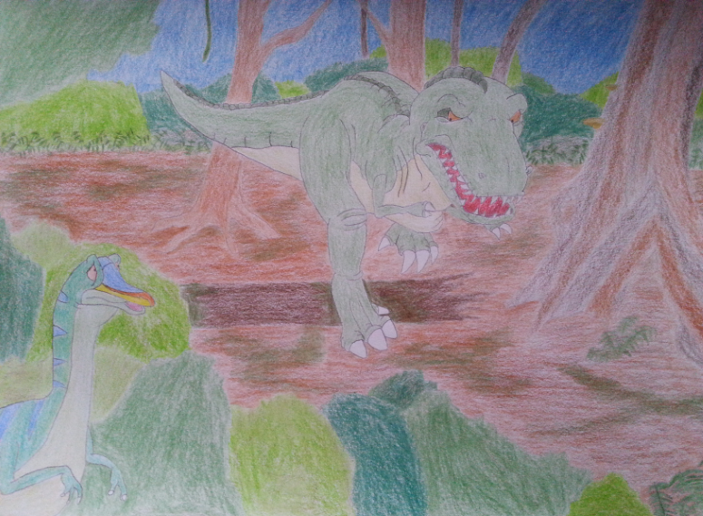
I was actually a little shocked when I loaded the image onto the computer. It seems to be brighter...
The effect was much worse when I scanned the image than when I photographed it, so here you can see the photographed image.

The picture was very tiring, but I am satisfied with it. That's why I didn't use shading, because I didn't want to disturb the picture.

I would like to participate in the Fanart Prompt "Daily life/Survival", if possible.

I had a few experiences during the last pictures I drew. What always impresses me is that every time I finish a picture, I think to myself: "I won't be able to do that so good again!" Then I start to draw a picture after all, and it becomes successful again. On the one hand I doubt myself every time, on the other hand I am always impressed by myself in the end.
« Last Edit: December 08, 2018, 04:41:25 PM by LeventeII »


Flathead770

  • Member+
  • Cera
  • *
    • Posts: 3136
    • View Profile
Oh hey, so you did manage to get a drawing done for the prompt. Awesome!

You mentioned how you took screenshots to help and I can see where they're used as these poses look familiar, though they're used in a good way and they fit together quite nicely. The expression for the rainbow face is perfect with his fear of getting caught and I like the small patches of grass in the dirt (it's something that I've kinda wanted to try at some point myself)

I know all too well about worrying about ruining a drawing when trying to shade, and I still feel like I don't go far enough with it in general. If you're afraid you could try do a bit of testing with your colours on a scrap piece of paper so see how it turns out. That's what I usually do anyways. Your shading has looked pretty good so far so I'm sure it would have turned out (though it does take a lot longer to include shading)

Quote
I had a few experiences during the last pictures I drew. What always impresses me is that every time I finish a picture, I think to myself: "I won't be able to do that so good again!" Then I start to draw a picture after all, and it becomes successful again. On the one hand I doubt myself every time, on the other hand I am always impressed by myself in the end.
You'll be a pro in no time :p It's good to hear that, you've come a long way in the 9 months since you started posting your artwork here. Keep it up! :DD


Sovereign

  • Member+
  • Ducky
  • *
    • Posts: 1940
    • View Profile
This is a really nice drawing and the whole idea behind it is quite awesome. Probably my favorite thing here is the sharptooth and its expression as the threat it presents is really effectively done. Also, it's nice to see a complete background and I'd say you've draw the trees and bushed quite well. However, I'd see the rainbowface looking even more frightened in this situation and at least for me, the brown color seems to overshadow the green even too much. As for the uncolored version, I can hardly hardly see what's in it. But overall, great job with this drawing. I agree with Flathead that you're making great strides in improving your skills! :yes


OwlsCantRead

  • Literally Guido シ
  • Member+
  • Ducky
  • *
    • Posts: 1208
  • "In the morning light, the evening star…"
    • View Profile
All art is good art in my unartist-ised eyes. :P

The large size of this picture was what originally drew me in. It seems rather pastel-like, at least that was the impression that I got. My big comment is that the colors seem a little faded... probably because of the color pencil/pastel-style being used? Oh, that and the background is well done with just one teeny thing...the bushes at the bottom right seem to mesh into the background and break the depth illusion. But that's probably just me. :P
Would it be possible for swimmers and flyers to get more love around here? Both figuratively… and literally.


That one guy who writes LBT fanfiction and accidentally makes them five times longer than he'd originally intended.


Ducky123

  • *feels like Pterano*
  • Member+
  • Littlefoot
  • *
    • Posts: 7484
    • View Profile
Oh hey, I didn't know you were submitting something to the challenge. I usually see it sooner or later (later in this case :smile) but just for formality either PM me or @Ducky123 me in the post to notify me (curious if this ends up giving me a mention now :DD (EDIT: Yep, it did :P))

About the drawing, there's not much to add to what's already been said. It's a cool drawing with a nice background, yep yep yep! One of your best, keep it up! :exactly
Inactive, probably forever.


LeventeII

  • Member+
  • Spike
  • *
    • Posts: 265
    • View Profile
Quote
Oh hey, I didn't know you were submitting something to the challenge. I usually see it sooner or later (later in this case ) but just for formality either PM me or @Ducky123 me in the post to notify me (curious if this ends up giving me a mention now)
I'm very sorry, I forgot. Next time I will do it!
EDIT: Did I mention you because of the quote? If so, then I' m sorry.


Thanks for the feedback!

On the weekend I rediscovered some of my screenshots, including this one. It's from the Stone of Cold Fire.

I also adopted the shadows, more or less successfully. Somehow the light on Cera's tail bothers me.


I traced the drawing on the computer to make the shading more visible. This is the result.

It was a lot of fun to draw this drawing, even if the colorizing was very lengthy. :)
« Last Edit: December 07, 2018, 06:52:41 PM by LeventeII »


jassy

  • certified member of the spike fanclub :)
  • Member+
  • Spike
  • *
    • Posts: 387
  • your local procrastinating fanartist!
    • View Profile
Ooh, I love the colors in this one! They’re very vibrant, and I really like the shading in the digitalized version! Nice work :DD
"Don't you ever wonder what's out there?"  :rainbowThinking


Flathead770

  • Member+
  • Cera
  • *
    • Posts: 3136
    • View Profile
Ah yes I remember you mentioning this one on Discord. It's nice to see it finished!

I see what you mean about the lighting on the tail. It almost looks like her belly with how much lighter it is, which I think is the main issue with it.

I think I like the digital version better overall as it's more clearer and the shading works a lot more (and you don't have to worry about the tedious colouring as well :p ). Great job!  :)littlefoot


LeventeII

  • Member+
  • Spike
  • *
    • Posts: 265
    • View Profile
Thanks, guys!  :)

The following drawing was created at short notice. This day had a very high worth for me, because today a year ago I rediscovered The Land Before Time. One year has already passed... I still have the feeling as if it had only been a few weeks ago.

I drew this drawing for this special event. A newborn dinosaur for a newborn love.   :)littlefoot
Basically I am satisfied, but the head bothers me in some way. It seems too flat compared to the original. The hardest part to draw was the head and the back. The eyes worried me especially. Nevertheless I'm happy with it.


Sneak

  • Guiding lights
  • Member+
  • Cera
  • *
    • Posts: 5131
  • Welcoming darkness
    • View Profile
    • Submachine series
I have to say - everything looks just perfect... except head part obviously. It is what first thing you notice. Looks like snout is not on his place.

https://i.pinimg.com/originals/ca/55/5a/ca555a586a53c1af794bbfe444f473f9.jpg
Can't agree more, head part is the most hard, no matter if you draw humans or animals. :'(

Next time make it better, learning is virtue! :)
Love your works, can't see more.
« Last Edit: December 08, 2018, 07:58:01 PM by Sneak »
6/14
0/26

--------------------------

ask me thread: http://www.gangoffive.net/index.php?topic=15601
my personal thread: http://www.gangoffive.net/index.php?topic=15412


Sovereign

  • Member+
  • Ducky
  • *
    • Posts: 1940
    • View Profile
Yep, it's simply an amazing drawing! The feeling in it is very well replicated from the original scene and the expression is as sweet as ever! :) I also love your coloring due to it's smoothness. Still, I have to agree with the head and I'd add that there's also something fishy with the mouth and his snout is perhaps a bit too dark. But other than that, amazing job and it's great to hear you wanted to mark that special day with this spectacular drawing! :)littlefoot


Flathead770

  • Member+
  • Cera
  • *
    • Posts: 3136
    • View Profile
Hey Levente! Great to see another drawing, especially one the has a profound meaning to you! It looks really good and I can only mirror what others and yourself have said about it. Comparing it with the actual scene I think the lower jaw extends too far out on his right side (so on the left side of the page). Everything else looks good though! :DD

Also, what colours did you use for Littlefoot? I can never seem to match it very well. (though I suppose baby Littlefoot appears more purple then usual)


OwlsCantRead

  • Literally Guido シ
  • Member+
  • Ducky
  • *
    • Posts: 1208
  • "In the morning light, the evening star…"
    • View Profile
Wow, it really looks like it's from the original scene in the movie! The light pastel shading gives it that soft glow effect that really makes Littlefoot even more adorable!
Would it be possible for swimmers and flyers to get more love around here? Both figuratively… and literally.


That one guy who writes LBT fanfiction and accidentally makes them five times longer than he'd originally intended.


Ducky123

  • *feels like Pterano*
  • Member+
  • Littlefoot
  • *
    • Posts: 7484
    • View Profile
Well, he's been a flathead since birth :P Nice drawing!
Inactive, probably forever.


LeventeII

  • Member+
  • Spike
  • *
    • Posts: 265
    • View Profile
Thanks for the feedback!

Quote
what colours did you use for Littlefoot?

Unfortunately, I don't know the names of colors, so I can't tell you exactly which colors I used. However, I can tell you that I have applied 2 different purple tones on one area. Only with this mixture I came to the result. In the last picture of Littlefoot I only applied 1 color. To be honest, this time I think it was a coincidence that the colors fit so well.


I finished drawing the next picture for a month already. The colorization took quite a long time, I think even longer than the drawing itself, that's why I finished it only today.
I really wanted to draw Sharpteeth again. I thought to myself: Why not a peaceful scene? That's how I got this idea.
I invented and drew the drawing myself again. I supported myself again a little with the sharpteeth from the movies, but mostly because of the anatomy.
My first idea as background was a desert, but afterwards I decided to choose this background because it seemed more peaceful.


Honestly, I'm completely split in two about this drawing. A part of me says that this drawing is very good for a self-creation. I especially like the right Raptor. But my other part tells me that this drawing is quite unsuccessful because it looks so simple and the left Raptor looks too bad.

Nevertheless, I would like to participate in the Fanart prompt „Draw something related to the Time of Great Giving“ with that.

Before I drew the background, I made a sketch on the computer. This is what it looks like. At first I wanted to show some waves in the water, but I didn't do it because the effect was too low for me.


Flathead770

  • Member+
  • Cera
  • *
    • Posts: 3136
    • View Profile
Hey it's always good to see you participating in the prompt! Someone has to submit something right? :lol (on time at the very least haha)

It's a lovely drawing and it's nice to see a nicer side to sharpteeth, even if the actual time of great giving is more related to the Great Valley dinosaurs.

And don't worry if you feel like your drawing doesn't seem as good as you might think. That sort of thing comes naturally when coming up with your own poses and such as you don't have an exact reference to copy from. Try not to get discouraged and keep at it and in the end it will be a lot more rewarding.

I won't say much more as I'm limited to phone use right now and I'm not a fan of typing on it so I'll just end with saying that it looks great!  :DD


Ducky123

  • *feels like Pterano*
  • Member+
  • Littlefoot
  • *
    • Posts: 7484
    • View Profile
Oh wow, I didn't expect someone to do sharpteeth with this prompt, really cool! :DD

I have to disagree with you on the raptors, I think they look really nice, both anatomy and colour! The background is simple again but it absolutely works and I admire your patience colouring all of this! I'm very impatient when it comes to filling a huge space with colour which is why I'm trying to learn a different colouring method :D But either way, it's a really nice artwork! I'm calling it a success, keep it up! Yep yep yep!  :)littlefoot
Inactive, probably forever.