The Gang of Five
The forum will have some maintenance done in the next couple of months. We have also made a decision concerning AI art in the art section.


Please see this post for more details.

Fanart by LeventeII

LeventeII · 133 · 22788

Sovereign

  • Member+
  • Ducky
  • *
    • Posts: 1940
    • View Profile
Nice job as always! :) The background looks really nice and the perspective with the background shore looks really cool! The layout of the drawing is one of your best ones yet as it offers us with a wider shot into the scene so good job with that. The problem I have here is that Mo looks quite simple here. I agree with Flathead on his jaw and his whole mouth looks a bit odd. Also, the dorsal fin looks quite small and I feel Mo looks a bit too undetailed as a whole. The coloring and smooth look of the water and the hazy mountains in the background make up for this fault so it's not too bothering. There's a good atmosphere here and there are far more positives than negatives in this drawing! Good job! :DD


Ducky123

  • *feels like Pterano*
  • Member+
  • Littlefoot
  • *
    • Posts: 7484
    • View Profile
First of all, if something is off with Mo, then it is so marginal that I don't mind it/don't notice it. He looks pretty spot on!

That being said, while the background is very light, it better than what I could do probably. Well done! :D
Inactive, probably forever.


LeventeII

  • Member+
  • Spike
  • *
    • Posts: 265
    • View Profile
Thank you very much! :)

Next time I'll probably pay more attention to his jaw.

I'll likely do another topic with my not LBT-related art.

I drew Littlefoot!  :)littlefoot  I tried to draw him as accurately as possible. Here is the original. It's from the 11th movie.
I have the impression that his foot is a little too big...


I think with colors it looks more like Ali. ^^


This time I included some shading again.
« Last Edit: December 08, 2018, 07:19:16 PM by LeventeII »


rhombus

  • Administrator
  • Littlefoot
  • *
    • Posts: 6779
    • View Profile
Very nice!  :)  Littlefoot's foot might be slightly too large, but the difference is so slight that that did not stand out to me.


Go ahead and check out my fanfictions, The Seven Hunters, Songs of the Hunters, and Menders Tale.


Flathead770

  • Member+
  • Cera
  • *
    • Posts: 3136
    • View Profile
Oh now this is looking good. I agree that I don't really see anything wrong here. I don't suppose you have considered joining in on the fanart prompts have you? It would be great to see another member participating! :smile

Awesome job! :DD


Sneak

  • Guiding lights
  • Member+
  • Cera
  • *
    • Posts: 5131
  • Welcoming darkness
    • View Profile
    • Submachine series
aaaaaaawwwwww :3

It's smooth and beautiful!
6/14
0/26

--------------------------

ask me thread: http://www.gangoffive.net/index.php?topic=15601
my personal thread: http://www.gangoffive.net/index.php?topic=15412


Sovereign

  • Member+
  • Ducky
  • *
    • Posts: 1940
    • View Profile
Yeah, great job here! :) The drawing itself is extremely well done and as others said, without any clear mistakes. I really like the sleeping pose but I wonder about the coloring. I think his main color is usually a bit darker but overall the coloring is done really smoothly. This is one of your best works yet! :DD


Ducky123

  • *feels like Pterano*
  • Member+
  • Littlefoot
  • *
    • Posts: 7484
    • View Profile
Don't think anything is off. Great job! :D
Inactive, probably forever.


LeventeII

  • Member+
  • Spike
  • *
    • Posts: 265
    • View Profile
Thank you again! :DD

I haven't thought about participating in the fanart-prompt yet. But I could try, actually. However, I hardly think my skills are good enough. I can only copy pictures, but not draw my own scenes.

I must honestly say, I am not satisfied with the next picture. What bothers me the most is the face of the sharptooth, which looks a little better with color. Besides, I don't like the background.
But I like Ducky! And that's why I decided to share it:


With background:


With colors:


Personally, it looks far too colorful to me. what do you think?
« Last Edit: December 08, 2018, 07:25:42 PM by LeventeII »


Sneak

  • Guiding lights
  • Member+
  • Cera
  • *
    • Posts: 5131
  • Welcoming darkness
    • View Profile
    • Submachine series
(hmm, yellowbellies decided to put and get stuck all pictures under 35 degrees... well... *turns my head under 35 degrees too*)

well, since this picture contains one of my three favorite characters of all before time...
THIS PICTURE IS SUPERAMAZING!!! :'D

Well, actually, you beautifully recreated my one of favorite tense scenes, starring superbrave Ducky who somehow should pay Sharptooth's attention and lure him outside and run from him to the lake (somehow), carefully fearly crawling behind beast's back...
Just love it!
Love colors too! but maybe... maybe, they're a little bit too colorful, I imagine scene a more dark and less colored. (yeah, less colored background) But that's fine.

And hey, for me, you drew Sharptooth perfect. :)
« Last Edit: April 06, 2018, 04:40:40 PM by Sneak »
6/14
0/26

--------------------------

ask me thread: http://www.gangoffive.net/index.php?topic=15601
my personal thread: http://www.gangoffive.net/index.php?topic=15412


Flathead770

  • Member+
  • Cera
  • *
    • Posts: 3136
    • View Profile
Quote
I haven't thought about participating in the fanart-prompt yet. But I could try, actually. However, I hardly think my skills are good enough. I can only copy pictures, but not draw my own scenes.
That's ok. You can join in whenever you feel ready :smile

I don't think that Sharptooth's face is all that bad considering how small it is due to it being way in the background. I think the background would look better with a lot darker colours but that can be pretty hard to do with coloured pencils in my more recent experience using them.

For Ducky, I agree. She looks suitably terrified and cautious.

Well done! :DD


Sovereign

  • Member+
  • Ducky
  • *
    • Posts: 1940
    • View Profile
I have to agree that the colors look too bright but aside from that, this drawing recreates that memorable scene perfectly. I like the smooth coloring and nicely-made expression from Ducky as well as well as the great perspective of the background. The sharptooth's face might not be too detailed but it is good enough considering the small focus on it in this scene! Well done again! ^^spike
« Last Edit: April 08, 2018, 03:21:52 PM by Sovereign »


Ducky123

  • *feels like Pterano*
  • Member+
  • Littlefoot
  • *
    • Posts: 7484
    • View Profile
I like the colourful background :D

You are very similar to me there. Give me a reference and I can draw something decent. Let me draw from memory and prepare to run... :P It's better better when you draw stuff a couple times but without any sort of natural talent (which I don't have) it is tremendously hard to come up with your own environments and poses / perspective and for them to look convincing and good. I'm struggling a lot with it myself.

Eithet way though it's a great drawing :D
Inactive, probably forever.


DiddyKF1

  • Monkey of Many Mysteries from the Fruitiest Forests
  • Member+
  • Petrie
  • *
    • Posts: 830
  • Proud supporter of DuckyxPetrie!
    • View Profile
I think the colors were a very nice touch. :D Ducky's color does seem a bit off in the slightest, but I guess that's because of the brightness. Still, she looks so good in this. In fact, I'm not the best at shading, myself, and I'm still trying to get the hang of it.

One thing that stands out to me is how the orange rock Ducky is hiding behind looks somewhat glossy. When I'm viewing this from a certain distance, it looks like a large crystal. The sharpness of the edges also gives it a crystal-like appearance.

Oh, and Sharptooth looks like he's got some sort of evil vendetta by the look of his expression! LOL!
Suddenly, I've written so many fanfics that I can't possibly list them all! :P


Ducky x Petrie forever! :)petrie :duckyhappy


LeventeII

  • Member+
  • Spike
  • *
    • Posts: 265
    • View Profile
I have finished another picture.  :) This time I tried to create something own.
I took several screenshots from different Land Before Time movies. My idea was it to make a hybrid out of several dinosaurs.

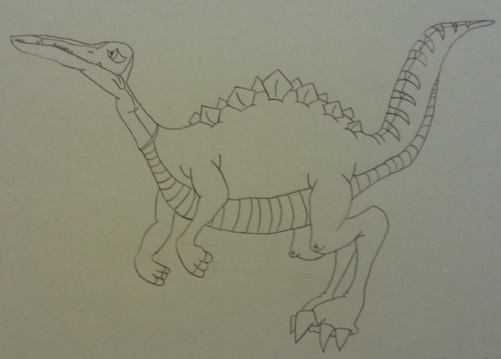
I took the following dinosaurs as a template:

-Flier from V for the Head
-Fast-Biter from XI for the Body
-Spiketail from VIII for the Back
-Sharptooth from V for the Tail
-Fast-Biter from the Series for the back legs
-Rainbowface from VII for the arms.

The result is a kind of raptor.
At this point I would like to mention that this drawing was made independently of Jurassic World 2. I started working when the film wasn't out yet.

Here is the drawing without color. I traced the contours so that they could be seen better:


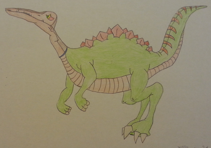
The next thing I thought about was the colors it should get.
I wanted to keep the head as close to the original as possible. So I needed a color for the body that matched the head. However, it should not become monotonous either.


I took a break after that.
I digitized the image to be able to plan the shading and the background on the computer. These two interesting works were created in the process:
digital 1 ; digital 2

Next was the shading. When I put too much black paint on the neck, I had to erase it. But the eraser couldn't completely fix my mistake. But that's exactly how the shadow looked good. So wherever I needed a shadow, I pressed hard on the paper with a black pencil and then erased it.
I am satisfied with the result:


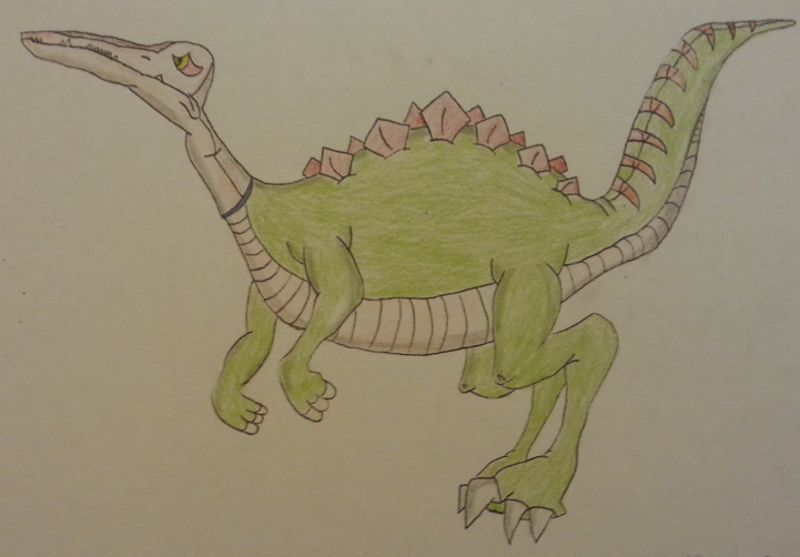
Finally, I needed a background. Here I was completely unplanned at the beginning.
It was certain that the hybrid should stand on a rock, and behind it the horizon should be visible.
That's the way the pose would fit, I thought.
My ideas were savanna, desert, mountains and sea. I chose an ocean with rocks. I chose sunset as the time of day. It shouldn't seem too peaceful.
It's not easy to see the background, which bothers me. But I like the end result.


I simply call my picture "The Hybrid".

I would like to participate in the fanart prompt "draw an OC " with that.

We should name the hybrid. Do you have an idea for a suitable name?
« Last Edit: December 23, 2018, 07:28:32 PM by LeventeII »


Flathead770

  • Member+
  • Cera
  • *
    • Posts: 3136
    • View Profile
Oh now that's definitely unique and interesting and I enjoyed getting some insight on the design and creation process as well :smile

The most dramatic part of the hybrid feels like the flyer head but when thinking about it, it's sorta similar to a raptor head, just thinner and longer so in a way it kinda works here. The only real main anatomy issue that I have is that I feel like its legs are a little too small, which makes it feel like his front half is longer and more front heavy then it should be. The background is simple but nice as well. The grey rocks go well with the blue ocean.

Great job and it's good to see you participate in the prompt! :DD


Sneak

  • Guiding lights
  • Member+
  • Cera
  • *
    • Posts: 5131
  • Welcoming darkness
    • View Profile
    • Submachine series
strange to see such creature. :O Rainbowfaces, what have you done again with your experiments? XD

Though I like an idea, a product became obvious disproportional for me, so I am sad to see this poor creature, he looks so sad too...

Anyway, thank you for drawing!
6/14
0/26

--------------------------

ask me thread: http://www.gangoffive.net/index.php?topic=15601
my personal thread: http://www.gangoffive.net/index.php?topic=15412


Ducky123

  • *feels like Pterano*
  • Member+
  • Littlefoot
  • *
    • Posts: 7484
    • View Profile
I was really really curious what kind of drawing you were going to do after what we talked about in PM. This hybrid creature certainly looks a little weird (which is not a bad thing at all haha) but the idea is very creative and funny, yep yep yep :smile

Sharing your thoughts and your work progress is a nice touch as well, thank you very much :)

I also like your use of a very dark and strong lineart. I also tend to prefer it when the lineart is clearly and easily visible and I believe that it can make a great difference in how the drawing looks when it's done :yes

As for the colouring, I think you've also done a good job and the colour choices look alright to me. Making the background colours rather light was probably a good decision here as well, since they don't take the attention away from your hybrid dinosaur :)

In short, great and really creative drawing, meets the fanart prompt very well  :smile
Inactive, probably forever.


Sovereign

  • Member+
  • Ducky
  • *
    • Posts: 1940
    • View Profile
Well, this is another solid drawing from you! :) The strongest points here are the vigilant expression and the anatomy which looks as nice as it can with a creature like this. I agree with Ducky that the lines are very smooth and look good but I'd say the background could have been a bit more colorful. Yet, it's nice that the Fanart prompt is getting a bit more artists and this is a great entry for that challenge! Nice job as always. :yes


LeventeII

  • Member+
  • Spike
  • *
    • Posts: 265
    • View Profile
Thanks for the feedback! :)

I tried new characters now. I have chosen the Rainbow Faces!

This picture took a while, but I am satisfied with the result.


With colour and background:


I like the rainbow faces. They often make me think about what they are and why they do things. That's why I drew them now. I dedicate my 100th post to them! :)
« Last Edit: December 23, 2018, 07:15:16 PM by LeventeII »