The Gang of Five
The forum will have some maintenance done in the next couple of months. We have also made a decision concerning AI art in the art section.


Please see this post for more details.

Fanart by LeventeII

LeventeII · 133 · 22785

LeventeII

  • Member+
  • Spike
  • *
    • Posts: 265
    • View Profile
Thanks! :)

This time I draw the probably first scene of Ducky. :)

I tried to insert the background a bit. Now the picture is much bigger.

I could take a second photo if the picture can't be seen well.


In my eyes it looks a little pale...

What could I draw next? The Sharptooth of course, but what else?
« Last Edit: December 08, 2018, 04:52:27 PM by LeventeII »


Flathead770

  • Member+
  • Cera
  • *
    • Posts: 3136
    • View Profile
I'm falling behind on commenting on these.

Chomper: I agree with Sovereign. His right knee seems placed too far inwards when it seems like it would be situated somewhere behind his right claw. Very nice drawing though.

Ruby: Hey this looks famaliar. That's the first drawing that I did of Ruby as well :lol Great job with it!

Baby Ducky: Backgrounds are are scary, at least for me (I've only recently started to seriously attempt them myself). I find it can be hard to make it look good without colour or doing it in greyscale (as opposed to just lineart). I see you started with some shading around the rocks and dirt mount. Keep at it and you'll get the hang of it!


LeventeII

  • Member+
  • Spike
  • *
    • Posts: 265
    • View Profile
Thank you! :)

I think knees are my biggest problems. ^^


I was bored this evening, so I tried to paint Ruby. I couldn't find the exact colors, but I think it isn't that bad. It seems that the colors are to pale... I will work on it.


Don't worry, I have a Backup. ^^
« Last Edit: December 08, 2018, 06:32:27 PM by LeventeII »


Sovereign

  • Member+
  • Ducky
  • *
    • Posts: 1940
    • View Profile
Sorry that I missed the previous drawing! :oops I really like Ducky's pose and the layout of the picture is well done. I like the the style you took with the background vegetation: it looks rather atmospheric! ^^spike However, the background could be slightly more pronounced and major portions of it seem a bit empty. Still, it is a good start to doing backgrounds. :) Also, good job with coloring Ruby! The colors look really smooth and the tones aren't too far from the original one. I agree with Ducky that any drawings look way better with colors and so does certainly this one! :yes


Flathead770

  • Member+
  • Cera
  • *
    • Posts: 3136
    • View Profile
Colored Ruby. Nice!

The colors do seem to match pretty closely to Ruby. For the colors being too pale it might help to do multiple layers. When I color with colored pencils I usually do one layer fairly lightly then go over it a second time pressing harder.


LeventeII

  • Member+
  • Spike
  • *
    • Posts: 265
    • View Profile
Thanks! :)

I don't have many colored pencils, so it's a bit difficult to colorize the pictures.
At next I'm going to draw a colorized picture with background. I'm optimistic that it will look good.

When I draw only with a pencil, I can not insert the background properly. That's the reason why I shaded it. I'm sure that I can paint the background  better with colors. I'll try the tip with the layer, perhaps it will help. We will see. :)


Ducky123

  • *feels like Pterano*
  • Member+
  • Littlefoot
  • *
    • Posts: 7484
    • View Profile
Ruby is a bit difficult to draw because her whole design is quite specific and little details matter much more than when drawing a longneck. The end result is really nice though, well done!

And dang, I have tried to draw that Ducky scene myself not too long ago and it failed :bang I see you had more luck with it haha  :lol
Inactive, probably forever.


LeventeII

  • Member+
  • Spike
  • *
    • Posts: 265
    • View Profile
I have drawn one new picture. I colorized it as well as an old one. :)
The colors are not the same as the colors in the original. I don't have the right colored pencils.
 

A tired Spike. It took 3 hours.  :^^spike


Colorized:


Cera colorized:


The shades are bad I think, but I don't want to edit this picture anymore. I hope the next ones will be better.


I didn't add a background because they weren't interesting. You could only see the ground.
I actually wanted to draw this Picture, but I had troubles, so I gave up.
« Last Edit: December 08, 2018, 06:53:15 PM by LeventeII »


Sneak

  • Guiding lights
  • Member+
  • Cera
  • *
    • Posts: 5131
  • Welcoming darkness
    • View Profile
    • Submachine series

Littlefoot505

  • Member+
  • Ducky
  • *
    • Posts: 1099
    • View Profile
They're pretty good! The coloring may not be perfect, but it's really great considering you didn't have the right colored pencils.


Sovereign

  • Member+
  • Ducky
  • *
    • Posts: 1940
    • View Profile
Spike looks great here! The pose fits him and the details are really impressive! I also like the coloring in both pictures, it looks quite smooth! :)
« Last Edit: February 12, 2018, 06:25:56 PM by Sovereign »


Flathead770

  • Member+
  • Cera
  • *
    • Posts: 3136
    • View Profile
I know very well not having the right colours. Even so, the colours are close enough that it's not too big of deal. I see you've worked on shading as well which looks good in both drawings. The Spike drawing is well done as well with no major issues. At the base of his neck it looks like his spine cuts into his neck to me but that's about it.

Keep up the good work!   :smile

Quote
I actually wanted to draw this Picture, but I had troubles, so I gave up.
That could be a fun image to work with. Keep at it and you'll get there!


Ducky123

  • *feels like Pterano*
  • Member+
  • Littlefoot
  • *
    • Posts: 7484
    • View Profile
Hey, it might not look that great yet but at least you had the courage to attempt doing the shading with coloured pencils. I've been drawing for about 5 years now and I still don't trust my abilities enough to take that step :P
Inactive, probably forever.


LeventeII

  • Member+
  • Spike
  • *
    • Posts: 265
    • View Profile
Thank you all for the feedback! :)

I finally found a good picture of a Sharptooth after a long time of searching.
The drawing itself took 4 hours, the coloration +2 hours.
The original


Colored!


Even though the colors are not the same as the original, I think it doesn't look bad.
In the colored picture I traced the contours with black to see them better.
« Last Edit: December 08, 2018, 07:03:00 PM by LeventeII »


Sovereign

  • Member+
  • Ducky
  • *
    • Posts: 1940
    • View Profile
Very nice! :) It's rather funny that Flathead did this exact same pose previously but you, too, managed to capture it very well. I really like the coloring as it gives the scene a really good feeling to it and the anatomy works perfectly as well. His right hand looks a bit too thin, however, but that's just a minor detail! Well done with this one! :yes


Sneak

  • Guiding lights
  • Member+
  • Cera
  • *
    • Posts: 5131
  • Welcoming darkness
    • View Profile
    • Submachine series

Flathead770

  • Member+
  • Cera
  • *
    • Posts: 3136
    • View Profile
Well now, doesn't this ever look familiar. Just as Sovereign has mentioned I had drawn this same pose as well (in fact it was the first one in my fanart topic) :lol It's nice seeing it colored this time around and I agree that his one arm looks a little thin.

I'm not sure why they decided on not having pupils on some sharpteeth. I ended up adding pupils in my drawing because I find it looks awkward without them.

Anyways, good job with the drawing. It's great to see more artwork from you! :DD


Ducky123

  • *feels like Pterano*
  • Member+
  • Littlefoot
  • *
    • Posts: 7484
    • View Profile
Great job! :D

Don't really see any flaws with neither lineart nor colouring :)littlefoot
Inactive, probably forever.


LeventeII

  • Member+
  • Spike
  • *
    • Posts: 265
    • View Profile
Thanks! :)

I discovered Flathead's picture while I was painting mine. Actually a big coincidence, because I had drawn it from an own screenshot from the movie.
The thing with the eyes, I actually wanted to draw them with pupils too, but I think without pupils he looks more frightening.

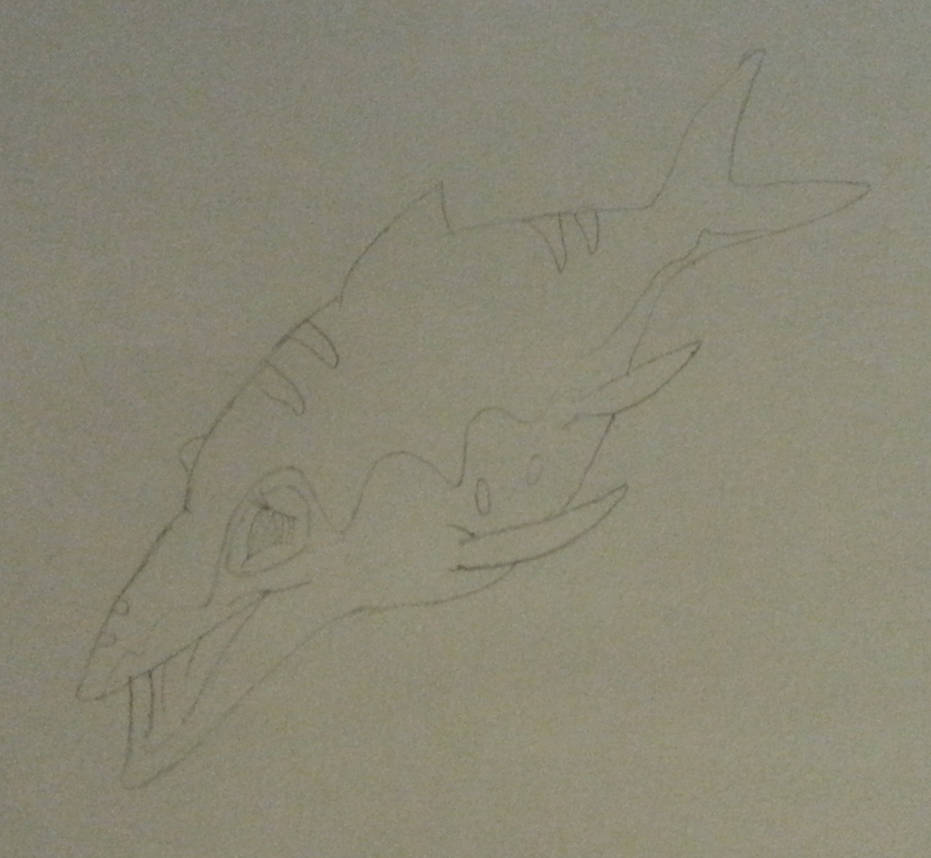
This time I drew Mo. :) It was a bit more difficult because the original had only a small resolution. Drawing and colorizing took about 3 hours.


I tried to add some background. But I didn't shade it. That would have been too complicated for me.


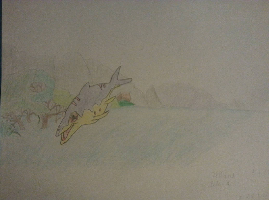
I didn't draw Mo quite correctly, but I'm still satisfied overall.

I also drew something not LBT-related. Should I upload it anyways?
« Last Edit: December 08, 2018, 07:13:11 PM by LeventeII »


Flathead770

  • Member+
  • Cera
  • *
    • Posts: 3136
    • View Profile
Great job with Mo! I like drawing Mo. It's more relaxing not having to worry about hands and legs :p Everything looks well done here, the only small nitpick I would say is that his lower jaw extends past his upper jaw, giving his nose a small appearance.

The background I feel is much improved over your last one and I think having it colored is the main reason. For shading it looks like you had the right idea with the one mountain to the right of Mo. I've always been afraid of ruining my drawing with shading and coloring but I think the best thing to do is just go for it and see how it turns out. Learning first hand through your mistakes is one of the best ways to learn after all.

Well done! :smile

Quote
I also drew something not LBT-related. Should I upload it anyways?
Go right ahead! Though non LBT art is usually posted in another topic under 'The Arts' -> 'Visual Art'