The Gang of Five
The forum will have some maintenance done in the next couple of months. We have also made a decision concerning AI art in the art section.


Please see this post for more details.

Fanart by LeventeII

LeventeII · 133 · 22790

Sovereign

  • Member+
  • Ducky
  • *
    • Posts: 1940
    • View Profile
Yeah, this is another good idea for this prompt as it brings together these characters in a way very uncharasteristic for either of them. Guido looks very nice overall and both of the characters' expressions have been done well, even if the criticism pointed by ImpracticalDino and Flathead is rather fair. I'd also add that the lack of background is quite eye-catching due to there being two characters as well as the waterline. But overall, it's good to see more fanart from you! :)


Ducky123

  • *feels like Pterano*
  • Member+
  • Littlefoot
  • *
    • Posts: 7484
    • View Profile
I don't have much to say, this is really well done once again. Indeed a very fitting entry for the OOC theme :^^spike
Inactive, probably forever.


LeventeII

  • Member+
  • Spike
  • *
    • Posts: 265
    • View Profile
Quote
As for constructive criticism, Mo's snout is too pointed. Try curving it a tiny bit. Also, Mo's color scheme is wrong, as the upper half of his skin is supposed to purple, not a light shade of blue. Does this have something to do with dimorphism and colors having a meaning? Mo is a male keep in mind, despite his purple skin color.

I didn't have the right color at that point, but on closer look I recognize the differences. And the pointy nose is actually a bit irritating, so I fully agree.

Thank you very much for your feedback!  :)

During the summer vacation I had a kind of sudden inspiration of a picture. It is a scene from the Fanfiction "Light Among the Darkness" by Anagnos. Thanks for his permission at this point!  ;)


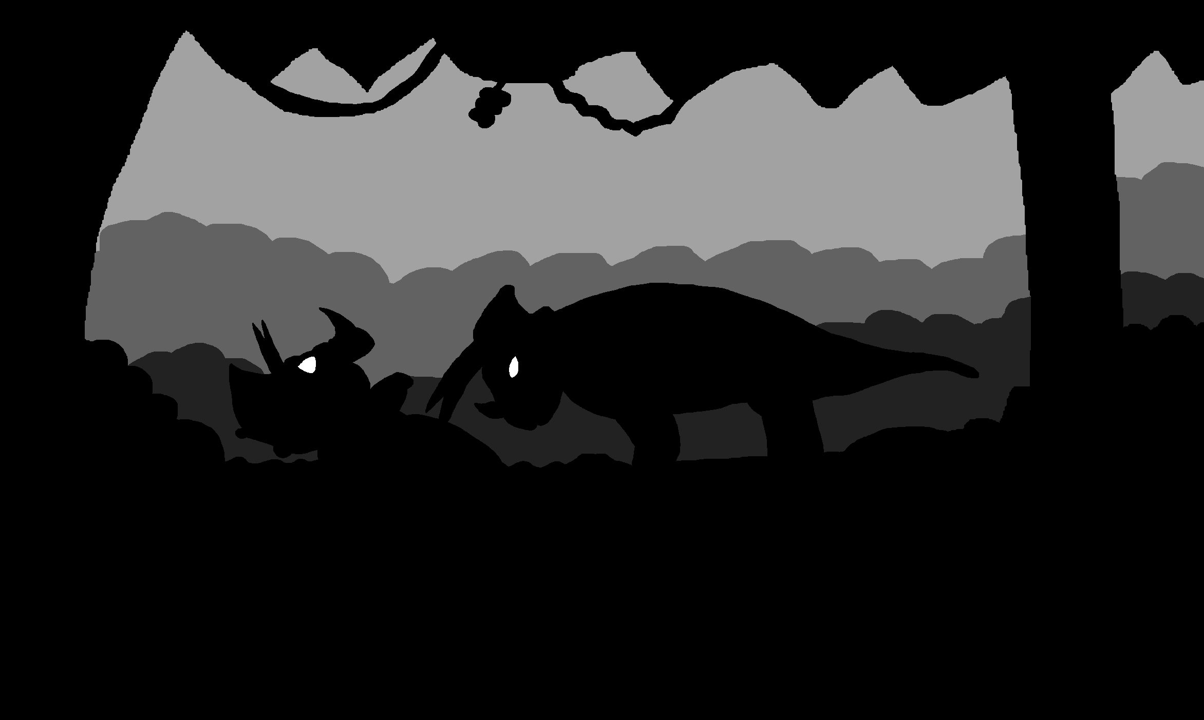
Originally, I drew the drawing by hand. I drew the figures, then, as usual, I made a digital sketch to work on the the background.

It was already clear to me from the beginning that it would be a shadow picture and that the eyes should shine. When I sketched the background, I noticed my fatal mistake: I drew the hand drawing so close to the edge of the paper that the background didn't fit in.
Actually, I wanted to start the drawing completely anew, but I was very satisfied with the characters. Therefore I improved the digital drawing. In the end, digital was the better choice, because the colors are much cleaner. I think in this example that I have created a shadow image, the digital medium seems more suitable.

The idea that I would include several layers by using gray scales came to me afterwards. I wanted to focus on the dark atmosphere of both the forest and the whole scenery.

With this drawing I would like to participate in the  Fanart Prompt "Draw an OC".

The most difficulties were caused by the neck frills. I wasn't completely satisfied until the end, but I tried to make the best out of it. In some places I am quite satisfied, for example with the legs, the eyes and the background. But the faces worry me a bit.

I experimented a lot, especially with the background. In any case, it was a lot of fun to create this drawing!   :DD


Sneak

  • Guiding lights
  • Member+
  • Cera
  • *
    • Posts: 5131
  • Welcoming darkness
    • View Profile
    • Submachine series
At first I thought "what is this? LBT in Limbo universe?" :O
Drawing is simple but looks very impressive! Good job!
(Didn't read this fic)
6/14
0/26

--------------------------

ask me thread: http://www.gangoffive.net/index.php?topic=15601
my personal thread: http://www.gangoffive.net/index.php?topic=15412


Flathead770

  • Member+
  • Cera
  • *
    • Posts: 3136
    • View Profile
Hey you made it with a few days left to spare! (Now it all hangs on me to finish on time :p )

I like these types of drawings. Very stylized.

Can't say that I've read the fanfiction so I'm not sure what the character dynamic are between these two, but it doesn't look like they're on the best of terms.

I think the one thing that might help with a silhouette drawing like this is to make sure that the outline of the characters are well defined as that's all we can see of them. The one on the right is good but the left blends in with the foreground making it sorta hard to tell what's going on.

Very cool idea though!  :smile


Mumbling

  • Administrator
  • Littlefoot
  • *
    • Posts: 8933
    • View Profile
Yes! I love silhouette drawings. Amazing job :) Similarly to the comments above I did not read the fic so I am not familiar with the characters, but that one on the right is maaad!


Anagnos

  • Member+
  • Ducky
  • *
    • Posts: 2561
  • Keep it clean! Respect public property!
    • View Profile
I already gave my opinion about it privately to Levente, but I'll say it again. A few hours spend on a picture such as this, while it may be mediocre in comparison to some of the other works I've had the pleasure of seeing, it is quite exclusive piece. I actually imagined this particular scene to play out exactly like you did, so there's no problem there. If there is one nitpick I have to point out, Vilar's horns seem a bit odd to say the least. But that is mild in comparison of the picture in its entirety. I think you did a wonderful job recreating this hauntingly sad scene, Levente! :^^spike


ImpracticalDino

  • Member+
  • Cera
  • *
    • Posts: 4166
  • Be my lover, Littlefoot. <3
    • View Profile
I haven't read or plan on reading your fanfiction LeventeII, but like others have said, you did a good job on this drawing with two characters that don't seem to be on the best of terms. For constructive criticism, the edges and outlines in the drawing is on the rough side, so a smoother polish on those would be handy. I also agree with Anagnos about the horns, but I can't seem to exactly describe or pinpoint what makes it odd. It's probably the fact that a silhouette drawing was a bit harder for me to fully analyze and get the full picture.

Overall, keep up the good work! :)littlefoot


Discord! I'm howling at the moon! And sleeping in the middle of a summer afternoon...


Sleeping-force's-inside

  • Ducky
  • *
    • Posts: 1023
    • View Profile
I also agree with Anagnos about the horns, but I can't seem to exactly describe or pinpoint what makes it odd. It's probably the fact that a silhouette drawing was a bit harder for me to fully analyze and get the full picture.

Personally, I think it's the angle. These horns look - to me - like they are bending down too much, instead of the up or straight they normally are.


ImpracticalDino

  • Member+
  • Cera
  • *
    • Posts: 4166
  • Be my lover, Littlefoot. <3
    • View Profile
Quote from: Sleeping-force&#039;s-inside on August 29, 2019, 01:40:39 PM
Quote from: Sleeping-force's-inside on August 29, 2019, 01:40:39 PM


I also agree with Anagnos about the horns, but I can't seem to exactly describe or pinpoint what makes it odd. It's probably the fact that a silhouette drawing was a bit harder for me to fully analyze and get the full picture.

Personally, I think it's the angle. These horns look - to me - like they are bending down too much, instead of the up or straight they normally are.

Thanks for pointing out what I was trying to say. But for me personally, the horns are too pointed and straight, not really curved at all (for the threehorn on the left at least).


Discord! I'm howling at the moon! And sleeping in the middle of a summer afternoon...


Ducky123

  • *feels like Pterano*
  • Member+
  • Littlefoot
  • *
    • Posts: 7484
    • View Profile
simple but it's quite an interesting technique to convey the mood. Good job :)
Inactive, probably forever.


LeventeII

  • Member+
  • Spike
  • *
    • Posts: 265
    • View Profile
Thanks for the Feedback!  :)

The idea for the next drawing came relatively late. Normally an idea comes to me during the first month of a prompt, but this idea did not come to me until the end of October. Therefore I started this picture quite spontaneously.


Well, this picture completely divides me.
Littlefoot and the heart are, in my opinion, well done. But for Littlefoot I used some references. In contrast to him, I drew the Longnecks in the background almost completely free. This can be seen especially in the partly anti-proportional lines and the missing details. Both necks are too long. The body of the right is also too long. The feet look completely wrong.
For that, I think, the essential part, that there are two loving Longnecks, is quite well done.
The moment takes place during the night. But it was not possible for me to colorize it appropriately, so it appears much more like daytime, which changes the atmosphere.
Nevertheless, Littlefoot looks quite good and the picture conveys the right message, though not as elegant as I wanted it to be.

The subject of love has often made me think. I had a lot of fun drawing this drawing. It motivated me, made me think and gave me new ideas for other works.

I created this digital version before colorizing it in order to be able to plan the colors.

With this drawing, I would like to participate in the Fanart Prompt: Hurt/Fear.

I don't get it... Every time I come to the conclusion that I can no longer draw, for example because of several unsuccessful attempts to draw drawings or simply because I consider myself to be too unskilled, I manage to draw quite decent drawings with appropriate references. At this point I think of Littlefoot, because I think that I have succeeded especially well with him.  :)


Sneak

  • Guiding lights
  • Member+
  • Cera
  • *
    • Posts: 5131
  • Welcoming darkness
    • View Profile
    • Submachine series
Littlefoot's expression and general tone makes this picture impressive for me. :D Good work!
Yeah, longnecks at the background look... very bad, if you compare them to very good Littlefoot's appearance (except his back leg, I guess).

Anyway, thank you for showing it!
« Last Edit: November 02, 2019, 05:28:56 PM by Sneak »
6/14
0/26

--------------------------

ask me thread: http://www.gangoffive.net/index.php?topic=15601
my personal thread: http://www.gangoffive.net/index.php?topic=15412


Flathead770

  • Member+
  • Cera
  • *
    • Posts: 3136
    • View Profile
Could it be....Rhett and Ali have confessed their true feelings and left Littlefoot all alone?  :PAli

A different take on the prompt, but fits all the same. I know that it can be hard to get a night time picture to look right with coloured pencils and the digital version you have does help with that. I can see everything you criticized with your other longnecks in the background and I agree with them. Their faces look almost like some sort of snake faces, but the emotion is still present and conveyed so it's not all that bad. Another thing I want to bring up is that the blue longneck feet are higher up the the red one, giving the impression that it is further into the background. While its neck does go behind the red one so that is consistent it is a little jarring to be that far to the side in my opinion. As you said with Littlefoot, he is indeed well drawn.

When drawing without references what worked for me is to try and draw from memory, then compare to a reference to see the differences, then make any required changes to better match. Over time the general shape is a lot easier to replicate from memory as well as helping with poses that you may not be able to reference as well. Hope that helps a bit.

Good job and keep it up!


ImpracticalDino

  • Member+
  • Cera
  • *
    • Posts: 4166
  • Be my lover, Littlefoot. <3
    • View Profile
Could it be....Rhett and Ali have confessed their true feelings and left Littlefoot all alone?  :PAli

Don't. You. Dare. :anger


Love is the feeling that can really make or break a person. But in this case, both of these things are happening at once. I agree with your self-assessment of the two longnecks in the background that you drew Flathead770. It is mediocre and not as well proportioned or carefully drawn as Littlefoot, who shines front and center in this drawing. Like Flathead770 has said though, it doesn't take away from the emotion that you were trying to convey here. When you said that this photo took place in the night, I was a bit confused. Not because of what you said, but because of the setting represented here. I know the appearance you tried to make it, but in the hand-made drawing, it looks like a sun. Is it a sunrise or sunset? The atmosphere you made doesn't coincide with it. In my opinion, I felt like you should've adjusted the setting to either of the two options if making a nighttime setting with a moon in the background wasn't a viable option. I have nothing else to add, as Flathead770 has already pointed out all the flaws that I see with this picture. And Flathead770, it's nice to see an artist like yourself reflecting on their own drawings and being able to detect and see what could've been done better. That's another way an artist can improve besides observing others and receiving feedback. Keep up the good work!
:cerahappy


Discord! I'm howling at the moon! And sleeping in the middle of a summer afternoon...


Anagnos

  • Member+
  • Ducky
  • *
    • Posts: 2561
  • Keep it clean! Respect public property!
    • View Profile
Quote
Could it be....Rhett and Ali have confessed their true feelings and left Littlefoot all alone?

I don't think that is Ali and Rhett as their coloration don't exactly match. Perhaps Littlefoot is just feeling despondent when he has to witness others enjoy their happiness while he is stuck in loneliness. But I admit, that is an interesting concept you just proposed. ;)

My attention was immediately drawn towards what I reckon is supposed to be the sun, demonstrating profound love between two characters, and the sullen expression of Littlefoot in turn allures the observer to take a closer look at how this came to be in the first place. The pensive facial expression displays a heartbroken individual who may have recently lost something very important to him. While the background does the job, I feel like crafting a nighttime sequence would have been more beneficial in the long run, as what I presume is indeed the depiction of a sun, in this scenario, the moon would have added some much needed despondent emotion to the already gloomy demeanor. Like ImpracticalDino, I am not going to go further into this in detail, as others here have expressed my opinion on this quite well. Still, it is a lovely picture that indeed expresses that while love can be one of the best things that individuals can experience in their life, rejection and disappointment can shatter your entire world in a blink of an eye. These emotions were very well added into the delineation. I hope to see more art like this from you in the future as you seem to have a particular expertise in this line of drawing.


ImpracticalDino

  • Member+
  • Cera
  • *
    • Posts: 4166
  • Be my lover, Littlefoot. <3
    • View Profile
I think I had a mental breakdown in my other post, because I kept referring to Flathead770 despite the fact that LeventeII was the one who made the drawing. Either I can’t read or I didn’t pay attention to ANYTHING I wrote. :lol

I’m going to leave it unedited for you guys to laugh at. :P

Oops-eeps, Oops-eeps! :sducky


Discord! I'm howling at the moon! And sleeping in the middle of a summer afternoon...


Sovereign

  • Member+
  • Ducky
  • *
    • Posts: 1940
    • View Profile
I agree with most of your own thoughts. The two longnecks don't look that great but Littlefoot, on the other hand, is drawn excellently. In fact, his expression is quite amazing and it's one of the best things you've drawn thus far. One thing I'd like to mention, however, are the colors. They look a bit bland and make the drawing look a bit blurred as a whole. They should be starker, imo. But other than that, this drawing proves you have it in you to become even better in doing fanart. :)


Ducky123

  • *feels like Pterano*
  • Member+
  • Littlefoot
  • *
    • Posts: 7484
    • View Profile
I agree with your self-critical analysis about the background longnecks but Littlefoot is really well done. His expression truly conveys the emotion of sadness and being hurt and that clearly is the most important thing and you nailed it quite well :)

The simple background works very well here I think, adding to the overall look of the drawing but not taking away any focus from Littlefoot :)
Inactive, probably forever.


Mumbling

  • Administrator
  • Littlefoot
  • *
    • Posts: 8933
    • View Profile
Great job on Littlefoot's expression! Hurting from love is a very tough emotion that many of us have been through, and you captured the hopelessness well :yes