The Gang of Five
The forum will have some maintenance done in the next couple of months. We have also made a decision concerning AI art in the art section.


Please see this post for more details.

Fanart by LeventeII

LeventeII · 133 · 22816

Sovereign

  • Member+
  • Ducky
  • *
    • Posts: 1940
    • View Profile
Yep, great job with this drawing! The expressions look quite nice, especially the green raptor's, and the entire idea in this drawing is quite sweet. It's nice to see more sides of them than the one we all know. As for your concerns, well, the red raptor's hands are a bit too small and the coloring could be a bit more interesting. But despite those issues, nice job as always! :)


LeventeII

  • Member+
  • Spike
  • *
    • Posts: 265
    • View Profile
Thank you very much for your feedback, guys!

First I would like to show my latest drawing of Littlefoot again, but this time with a comment about the drawing itself.  :)littlefoot


It was an interesting experience to draw this drawing. It was the first time that I sketched a little so that I didn't have to worry about the structure when drawing the lines. I sketched a square for Littlefoot's snout, which was a great help because I find the beginnings of my drawings especially difficult.
Without wanting to be arrogant, I must honestly say that I am very proud of this picture. I like both the colorization and the cleanliness very much!

I would also like to show my next picture, which is my entry for the Fanart Prompt: Movie Poster.


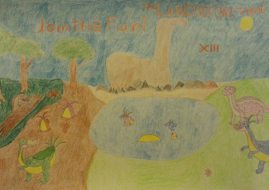
First of all I thought about which of the movies I should draw a poster about. I didn't find a good idea for any of them, only for XIII. I imagined a perspective from above and one should be able to see a bunch of Yellow Bellies. In the background the Sharpteeth should lurk, who in this case are the villains.

I spent the first few weeks of the year practicing. I printed some pictures of Yellow Bellies and tried to understand their bodies. The result was quite OK, I think I can now draw Yellow Bellies at least in a way that makes them recognizable.

My main problem during the whole process was the size. How could I draw an ocean of Yellow Bellies if they are so small? So I had to forego a large bunch and I drew bigger characters, like on the end result.

When the rock and the Yellow bellies were finished, I had to put in someone of the Gang of course. But I couldn't think of anything to put in the whole group. I finally chose Littlefoot, who was the one who wanted to help the Yellow Bellies the most.
Then I drew the baryonyx. Again I decided not to draw the whole group because of the size. Instead, I drew only the leader.

The title was the next challenge, because I couldn't find a suitable place for it. It was my plan to put it up in the center, but the rock was too much in the way. I decided to place it a little further to the side and not in a central position.

Finally, I thought of a slogan: "Join the Fun!" I especially like this phrase because it has two meanings: On the one hand, it means the joy of the yellow bellies how they have fun together. But it could also mean the approaching feast of the baryonyx as "Fun"...

Although I know that this picture is not a masterpiece and contains some mistakes, especially the title bothers me, I am still satisfied with it. I had a lot of fun with it, especially because I wasn't bound to any given poses. It was also an opportunity for me to try new things out.  :)


Flathead770

  • Member+
  • Cera
  • *
    • Posts: 3136
    • View Profile
I've made a quick comment to you already on you Littlefoot drawing but I'll say it again that it looks really good! That's a very good approach to starting your drawings as well by starting with simple yet similar shapes. I think the only criticism I'd give is that maybe his nose feels a little too short? Also including the white reflection in the eye helps as well.

Who would've thought that someone would go for LBT13 for their poster? :p
Certainly a shock but it's always nice to get surprised! I agree that it would be hard to draw so many Yellowbellies but at least you have a good amount of them on the page. I think my favorite one out of the bunch is Fooby :lol And that sharptooth peeking out from behind the log reminds me so much of Ozzy haha. For the title I feel like it would be better if it was lined up or put all together. Having it scattered like that makes it a little harder to read. Another minor point would be to try and add variety to the trees. Both trees that are standing in full view look identical. It can be hard to do but minor details like that can really help!

Good job with this one though! And ultimately having fun with it is more important then making it look perfect as that will lead to more motivation and more improvement! :smile


Ducky123

  • *feels like Pterano*
  • Member+
  • Littlefoot
  • *
    • Posts: 7485
    • View Profile
Good grief yellowbellies xD

Wow, you really put a lot of effort into this drawing, I can tell just reading your author's note and the drawing also shows this. Yellowbellies look good and so does Littlefoot and the raptor. I can also tell you took inspiration from LBT 13 drawing the background, it turned out nicely! Certainly a movie poster that'd have my attention :smile
Inactive, probably forever.


Sovereign

  • Member+
  • Ducky
  • *
    • Posts: 1940
    • View Profile
As others have implied, that's quite a unique take on the prompt. :p The overall layout is quite solid as is the idea of showing the Yellowbellies doing Yellowbelly things while also including Littlefoot and the sharptooth into this picture. The atmosphere here is quite good but for a poster, there perhaps could have been a clearer focus in this picture as showing a normal scene like this doesn't tell that much from the film itself. Also, the large areas between the characters look rather empty but that's the problem with pictures like these. Still, nice job with this one. :)


LeventeII

  • Member+
  • Spike
  • *
    • Posts: 265
    • View Profile
Thanks, guys!

Quote
Another minor point would be to try and add variety to the trees. Both trees that are standing in full view look identical. It can be hard to do but minor details like that can really help!
In fact, I didn't notice that at first about the trees, but I agree with you that a little variation would have been better.   :)

The next picture was a bit more difficult. When I started with the sketches, I came to the conclusion: "I hate dolphins!". When I started with the actual picture, it went a little better.


Actually, I was surprised by the result in the end. Nevertheless, it was very difficult to draw this drawing. The lines were very round and long. Especially drawing the bodies was very tricky, because it had to look neither too round nor too straight.
I started every ophthalmosaur with the mouth. Thereby also the position of the eyes resulted, because these "sit on the cheeks". When I draw the mouth, the lower half of the cheek is also drawn. From the snout, I worked my way to the tail.

I was a little unsure whether and how I should intimate water. First of all I wanted to indicate the water level at the top of the drawing, but that would probably only have distracted one. Dipping the drawing into a complete blue would have been a long process and would not have led to a satisfactory result. So I renounced water and I was able to concentrate on the colors of the fish without any problems. Especially the ammonite was important to me, the focus should be on it.
To make the whole thing more interesting, I inserted the seahorse.  :^^spike

I would like to participate in the Fanart Prompt: "Love/Family" with this drawing.

In the beginning for a short time I wanted to draw two Swimmers, but then I got the idea of this image, which I liked better. Besides, I wanted to bring in some variety and not to draw bipeds again.
Concerning the colorization, it was important to me that I don't only use the "standard" colors of Mo. I wanted a bit more variety here too, so I colored two fish of the group orange. Actually I also wanted to change the color of the eyes and the patterns, but I didn't want to go that far anymore, because I was worried that it might be too much of a change.

If I compare the fish with Mo, there are some inaccuracies. Nevertheless, I accepted these mistakes because they are not too disturbing for me. The only thing that bothers me, however, is the bright color in the mouth of the right ophthalmosaurs.

In the end I am satisfied with the drawing, despite the fact that it was very exhausting. It made me think and deal a little with marine life forms of the Mesozoic Era.  :DD


Mumbling

  • Administrator
  • Littlefoot
  • *
    • Posts: 8936
    • View Profile
The next picture was a bit more difficult. When I started with the sketches, I came to the conclusion: "I hate dolphins!". When I started with the actual picture, it went a little better.
:lol

Mooooo!  :Mo

I've always loved this character, and diving into his family story sounds like a lovely thing to do. Do their different colors indicate anything, or is there no clear distinction between them and is it just random? :D

I like how fascinated they all are with the ammonite. Sounds like a perfectly realistic thing for them to do  :PCera


Sneak

  • Guiding lights
  • Member+
  • Cera
  • *
    • Posts: 5132
  • Welcoming darkness
    • View Profile
    • Submachine series
Nice! Mo's family and two other habitants of Big Water are drawn wall.
IT would be hard (for me at least) to draw actual water where they all swim, but that's ok.
6/14
0/26

--------------------------

ask me thread: http://www.gangoffive.net/index.php?topic=15601
my personal thread: http://www.gangoffive.net/index.php?topic=15412


Sovereign

  • Member+
  • Ducky
  • *
    • Posts: 1940
    • View Profile
This picture looks very nice overall and it's always good to see a picture of Mo. I like the idea here as we saw very little of Mo's family and it is only fitting for them to be wondering about another wonder of the ocean. My only major issue is the very light color of water as it makes the picture look empty which is a bit unfortunate. I understand the issue you mentioned, though, and despite that issue, good job. :)


ImpracticalDino

  • Member+
  • Cera
  • *
    • Posts: 4178
  • Be my lover, Littlefoot. <3
    • View Profile
I like the representation of Mo's family, good job! I wonder what they would do with that ammonite, perhaps an underwater game equivalent to kicking around a pine cone just like the seven main characters, which is similar to soccer. Cute seahorse, by the way. Once it catches your attention, you just can't help but look at it only. Hmm... an outlier in the picture! Interesting!


Discord! I'm howling at the moon! And sleeping in the middle of a summer afternoon...


Flathead770

  • Member+
  • Cera
  • *
    • Posts: 3136
    • View Profile
Very nice to see a Mo drawing! Come to think of it, it's been quite a while since I've drawn Mo. Maybe I should change that at some point.

The drawing of Mo's family is well done with nice and varied expressions. Your earlier drawings had the issue with being faint with the colouring (don't worry I still feel like that's an issue with me as well) but this one seems to be really good in this regard!

Good job with the drawing! :smile


OwlsCantRead

  • Literally Guido シ
  • Member+
  • Ducky
  • *
    • Posts: 1208
  • "In the morning light, the evening star…"
    • View Profile
I like this piece. The artstyle gives it a very muted feel, which is quite fitting with the aqua theme going on here. Plus, more Mo is always good. :D
Would it be possible for swimmers and flyers to get more love around here? Both figuratively… and literally.


That one guy who writes LBT fanfiction and accidentally makes them five times longer than he'd originally intended.


Anagnos

  • Member+
  • Ducky
  • *
    • Posts: 2561
  • Keep it clean! Respect public property!
    • View Profile
That is indeed very nice work!  :cheers Even if I'm not the biggest fan of any kind of art in particular, I agree that it's very well done.  :yes And yes, good to see Mo appear more, I don't think I've seen him enough as it is.  :)


Ducky123

  • *feels like Pterano*
  • Member+
  • Littlefoot
  • *
    • Posts: 7485
    • View Profile
Itsa me, Mooooooo  :Mo

Wow, this looks really good! I've tried to draw Mo myself at one point in the past but never bothered to finish the drawing in the end. He sure is tough to draw and I picked a simpler pose than the guys you've drawn there. Good job  :^^spike
Inactive, probably forever.


LeventeII

  • Member+
  • Spike
  • *
    • Posts: 265
    • View Profile
Thanks for the feedback! I really appreciate it!

Quote
Do their different colors indicate anything, or is there no clear distinction between them and is it just random?

In fact, the colors have a meaning. I use the colors as a form of dimorphism in my fanfictions. :)

The following drawing has been in my mind since my last drawing. With this I would like to participate in the Fanart Prompt: "Out of Character".


I don't think I've ever seen any of the two characters this angry.  :^^spike
There's not really much to say. Again I decided against a background, because it doesn't have a meaning here. Here it is only about the two characters. I couldn't think of a suitable background.  But I don't want that missing backgrounds become the default. I want to add backgrounds again soon.

Although the colors don't fit 100%, I think they're still fine. The only thing that bothers me is Mo. Somehow I have the feeling that something is wrong with him.

With this drawing I also had some experience with feathers. I am sure that this will help me in future drawings. :)


ImpracticalDino

  • Member+
  • Cera
  • *
    • Posts: 4178
  • Be my lover, Littlefoot. <3
    • View Profile
No, don't be angry Mo! Be happy! :Mo

Interesting choice to have Guido and Mo angry at each other. Quite the odd pairing, I must say. This fanart definitely speaks "out of character" though. :)

Shame that there's no background again. I do understand why though. I imagine it'll be pretty time consuming, plus it would distract a bit from the actual porpoise of the picture.

As for constructive criticism, Mo's snout is too pointed. Try curving it a tiny bit. Also, Mo's color scheme is wrong, as the upper half of his skin is supposed to purple, not a light shade of blue. Does this have something to do with dimorphism and colors having a meaning? Mo is a male keep in mind, despite his purple skin color.

Does that cover all of your concerns that you have for Mo?

But overall, nice job on the characters LeventeII! :smile


Discord! I'm howling at the moon! And sleeping in the middle of a summer afternoon...


OwlsCantRead

  • Literally Guido シ
  • Member+
  • Ducky
  • *
    • Posts: 1208
  • "In the morning light, the evening star…"
    • View Profile
Mo angry? Never!
But come to think of it, you're right... the worst I've seen Guido is him being momentarily annoyed instead of actually angry.

Yeah, I suppose it would seem out of place and character of them both to be mad.
Would it be possible for swimmers and flyers to get more love around here? Both figuratively… and literally.


That one guy who writes LBT fanfiction and accidentally makes them five times longer than he'd originally intended.


Sneak

  • Guiding lights
  • Member+
  • Cera
  • *
    • Posts: 5132
  • Welcoming darkness
    • View Profile
    • Submachine series
Mo can be serious when danger comes, but being with bully face in peace time... And Guido looks like he's planning something evil...

 :lol I like it! Good job!
6/14
0/26

--------------------------

ask me thread: http://www.gangoffive.net/index.php?topic=15601
my personal thread: http://www.gangoffive.net/index.php?topic=15412


Flathead770

  • Member+
  • Cera
  • *
    • Posts: 3136
    • View Profile
I feel like they're whole argument is based entirely on their thoughts on water  :PCera

I know a thing or two on not wanting to put in a background so I feel your pain there haha

Guido looks really good, the only thing that could maybe be better is to have him not cropped off like that (though I get that that can sometimes happen when drawing). Mo also looks pretty good but I feel like his snarl looks off. Maybe having the edge of his mouth curl down a bit like Guido would help?

I'll get this added to the prompt list! Thanks for you submission! :DD


Anagnos

  • Member+
  • Ducky
  • *
    • Posts: 2561
  • Keep it clean! Respect public property!
    • View Profile
Quote
Interesting choice to have Guido and Mo angry at each other. Quite the odd pairing, I must say. This fanart definitely speaks "out of character" though.

Exactly what I was thinking about. But just because it's out of character doesn't mean that it can't work. I actually very much like this one, although Mo and Guido at each others throats seems a little... unlikely to happen, so to speak. And not only because Mo can't do it as well as Guido could...  :smile

Quote
Shame that there's no background again. I do understand why though. I imagine it'll be pretty time consuming, plus it would distract a bit from the actual porpoise of the picture.

While that is true, I must disagree. Background can give a lot of insight into the picture itself, but I do understand that it's not always needed. In this case it works quite well, though, so you will definitely not hear any complaints about that from me.

Quote
With this drawing I also had some experience with feathers. I am sure that this will help me in future drawings.

I love me some feathers, so this is an automatic win. :Mo And yes, moving out of your comfort zone is a good opportunity to develop your skills with drawing. Overall, very good one from you, Leventell! :)littlefoot