The Gang of Five
The forum will have some maintenance done in the next couple of months. We have also made a decision concerning AI art in the art section.


Please see this post for more details.

Show Posts

This section allows you to view all posts made by this member. Note that you can only see posts made in areas you currently have access to.


Messages - LeventeII

Pages: 1 2 3 ... 89
1
Starday Wishes / Re: Happy Starday LeventeII!
« on: October 16, 2021, 08:30:18 PM »
Thank you very much, guys! Even though I  am not as active anymore as I was used to be, I still like to remember the past times and the great time which I spent here! I really appreciate it!   :DD

2
Starday Wishes / Re: Happy Starday LeventeII!
« on: October 18, 2020, 01:59:03 PM »
Thank you very much guys!  :) It really does feel a bit strange that I am responsible for everything I do from now on. I had a lot of fun with my friends, and I am looking forward to happy years. I still have to get used to being 18, but I have got plenty of time for this now ^^

3
LBT Fanart / Re: Fanart by LeventeII
« on: July 10, 2020, 02:05:21 PM »
Thanks for the feedback!  :)

Quote
Also, thank you for the amusing image of Sharptooth wearing a nice, woolly scarf! :lol

I have no idea why I didn't notice my spelling mistake but hey, now we have got a cool idea. Maybe I can draw some kind of Christmas related drawing with the LBT cast. I think a scarf would fit Sharptooth.  :DD


Okay, here are two drawings which I drew some time ago. I didn't share them yet, so I think it's time now after more than a year!

The first one being Foobie. I remember drawing him was a bit difficult because of the many circles which I had to draw. I mean, there are only very little straight lines.


The second drawing is Cera. It is really impressive how the mood of the picture goes into the artist himself as I got a bit angry somehow while drawing her. The process itself was quite flawless and without any frustration. Another thing that was in my mind while drawing her was the fact how *round* she looks. However, I think it is because of the perspective.


The last drawing is Cera, again. I drew this one last summer after a longer break from drawing. I was very happy that it worked out quite well!


I don't think I have got any more LBT realated drawings which I could share at the moment. That means that the next drawing is going to be something new!

4
LBT Fanart / Re: Ducky & LeventeII - humanized LBT
« on: April 21, 2020, 05:16:44 PM »
Of course!  :) We already have got a storyline, we just need some more time which is the most important factor actually since we know what we want to draw. This project will continue, that's for sure!  :)

5
LBT Fanart / Re: Fanart by LeventeII
« on: April 20, 2020, 08:20:25 PM »
Thank you very much for your feedback!   :DD

The following drawing is actually one of my first hand-drawn drawings for the last few months along with some little anime-styled drawings. I am happy that I am still able to create drawings which aren't "bad". ^^

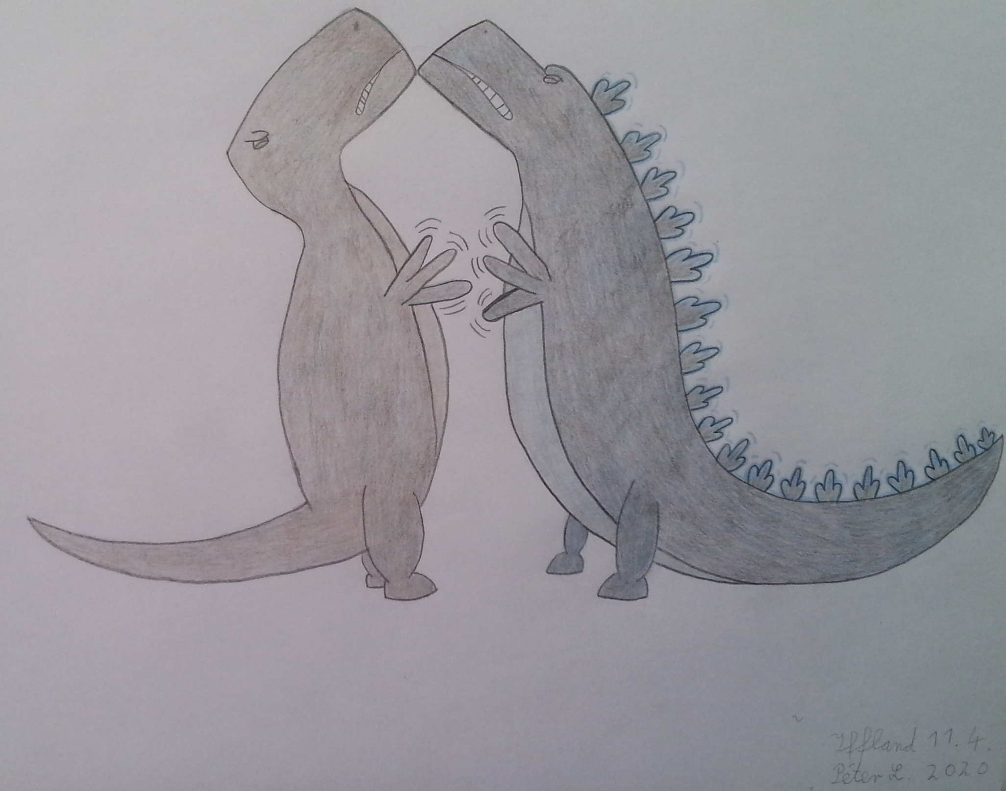
I would like to participate in the Fanart prompt challenge "Crossover" with this.


The two characters which I drew are Sharptooth and Godzilla, the universes are "The Land Before Time" and "Monsterverse". Monsterverse is a rather new term which includes the new American Godzilla movies from 2014 and 2019. One could say, it is a separate storyline from the Japanese Godzilla movies. The characters are the same though.

I took two separate pictures of each character to show the colors better. They are rather dark, that's why they seem black. I tried to match Sharptooth's color from the original movie and Godzilla's dark color with a bit blue.

Godzilla; Sharptooth

At first, I wanted to draw the heads very detailed and large with very tiny, cute bodies. But I thought that it would seem more cute if I made simple faces.

I decided not to draw a background, because I thought it wouldn't support the effect. I was thinking about drawing a "split" background. On the left side, Sharptooth's side, the background should look like a setting from The Land Before Time and the Background on the right side, Godzilla's side, should look like a setting from his universe.

What bothers me the most is that I couldn't manage to make Sharptooth's look recognizable because he doesn't have any special features like a scarf or something like that. Godzilla is easily recognizable because of his "spikes" on his back but I didn't know what to draw for Sharptooth, I mean he is just a regular Sharptooth in his looks. I didn't want to go too much into detail because this would have disturbed the simple, cute scene.

6
1988 Theatrical Release / Re: German audio story
« on: April 19, 2020, 12:29:47 AM »
Oh, I actually know this! I downloaded it one year ago and listened to it during a lengthy bus ride. I really like it. It's nothing special actually, there are the original German sounds but sometimes a narrator speaks. He narrates mostly during scenes without conversation, which means that the narrator doesn't get any "extra" time. Therefore, this audio story is exactly as long as the corresponding movie

7
Starday Wishes / Re: Happy Birthday Flathead770!
« on: April 12, 2020, 06:21:09 PM »
Happy round Starday! Make the most out of it!  :duckyhappy

8
Visual Art / LeventeII's other art
« on: April 02, 2020, 05:23:23 AM »
I have done some other art and drawings besides the Land Before Time in the past 2 years, I think it's time to show them!  :)littlefoot

I am going to show only one or two drawing per post because I think more than that would distract too much. I may also post sketches which I think are worthy enough to share with you.

Let's start with two dinosaurs!


In one of my exams, I had to draw a letter like in texts from the Middle Ages. We got a modern text though and the letter had to fit the content of the text. The text is about the fact that every life form is made of little elements like DNA. With this in mind, I drew the following drawing:
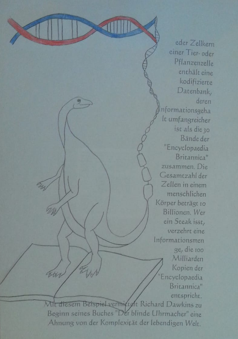


As you may notice, it is not completed. It's because I ran out of time  :p That's why I was only able to colorize the top. Also, the book should have gotten more details. But I like the overall idea, that's why I thought about sharing it. I drew this drawing in September 2019. The letter which I had to draw was “J“ by the way. Did you recognize it?  :smile
By the way, I know that the number of claws and fingers is off, but it was for a school work, so I didn't care. :PCera Given that I had only one reference which was a sketch by my sister, I think that it is not even that bad.

The next picture is a dinosaur from the movie “Dinotopia: Quest for the Ruby Sunstone”. This is the Dinosaur girl “26”, although I am not sure which species she is. I am also not to sure how related this movie is to the original Dinotopia. Nevertheless, here is the drawing:
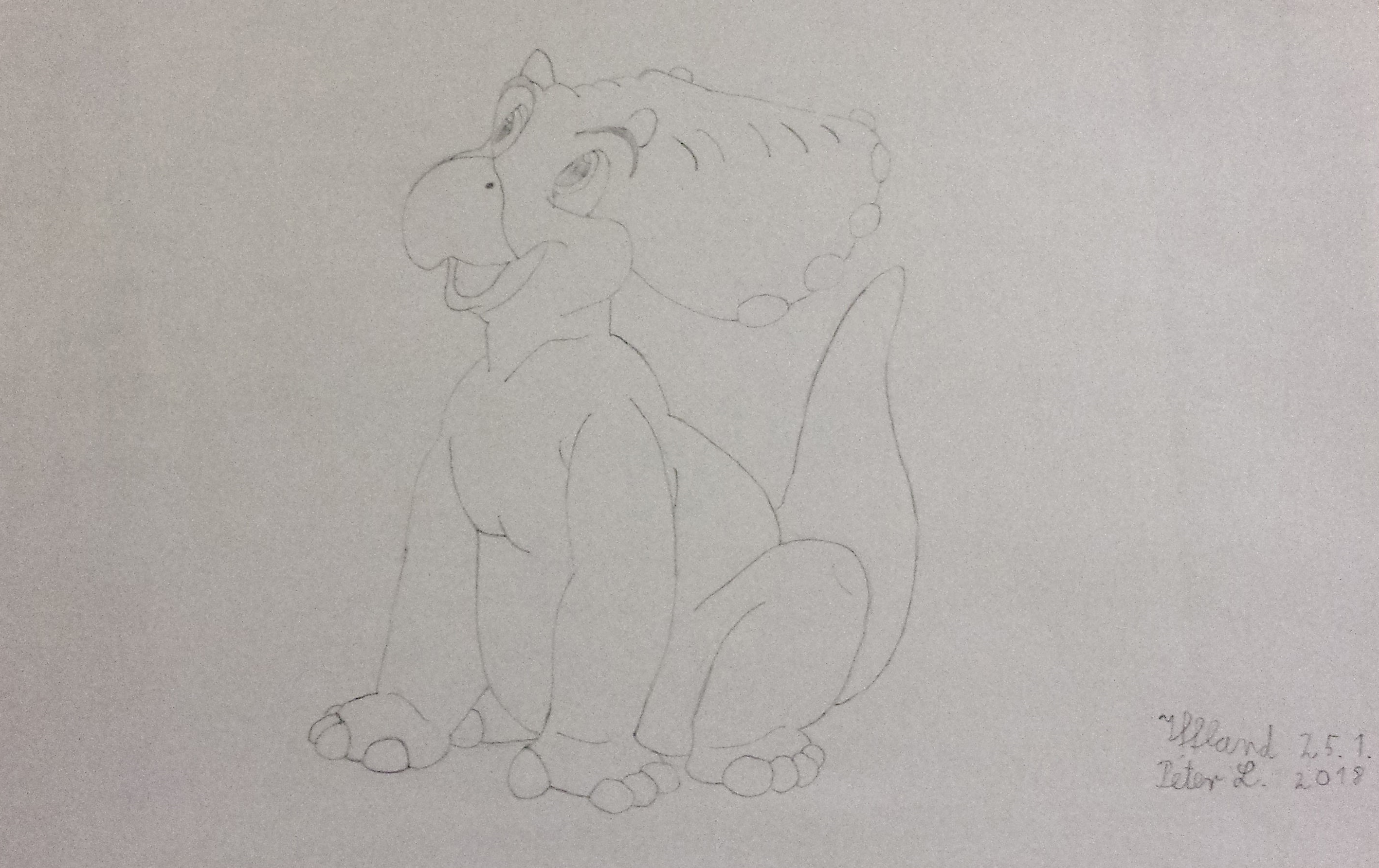


It has been more than two years since I drew this drawing? Time passes fast indeed...  :DD

9
Gamers Zone / Re: Worst Ways to Die in a Game
« on: April 01, 2020, 03:57:17 AM »
Dying because of a Gumba in any Mario Game is always terrible... But hilarious at the same time :lol

I think one of the worst ways to die in a Game is in "Until Dawn". If you make wrong decisions, the characters may be killed by 'Wendigos' brutally. It's a Survival Horror game in which the player has to make decisions which influence the story. If the character makes every decisions right, every character survives. But if the player makes too much wrong decisions, every character may die

10
LBT Fanart / Re: Fanart Prompt Challenge Discussion
« on: February 20, 2020, 10:54:16 PM »
I have the intention to participate, but it depends on whether I am able to realize my idea or not, that's why I am not entirely sure yet. I have got an idea already though.

11
LBT Fanart / Ducky & LeventeII - humanized LBT
« on: February 03, 2020, 04:07:36 PM »
Hello everyone! Ducky here! Ever since I made the prompts for the 2019 fanart prompt challenge, I’ve been looking forward to drawing this particular prompt! :)littlefoot

Green: Ducky123

Yellow: LeventeII


But as things usually go, I kept putting it off (because procrastination is my biggest enemy) until, one day, I saw a message in my inbox from LeventeII asking me to give some advice since I was also going to do anime-style humanization. As I responded to his request, listening to his ideas and plans, I realized that our objective is rather similar and it didn’t take long before the idea was born: We were going to collaborate! Yes, this is the first time someone does a collaboration for a fanart prompt! Pretty cool, huh? Anyways, enough babbling, here’s our entry for the Nov/Dec fanart prompt 2019: Humanization


1. One beautiful summer day, a girl named Ducky went to the pool with her friends to cool off and have a lot of fun.


2. Petrie was her best friend but unfortunately he couldn't swim very well so he merely watched as the girl enjoyed herself.


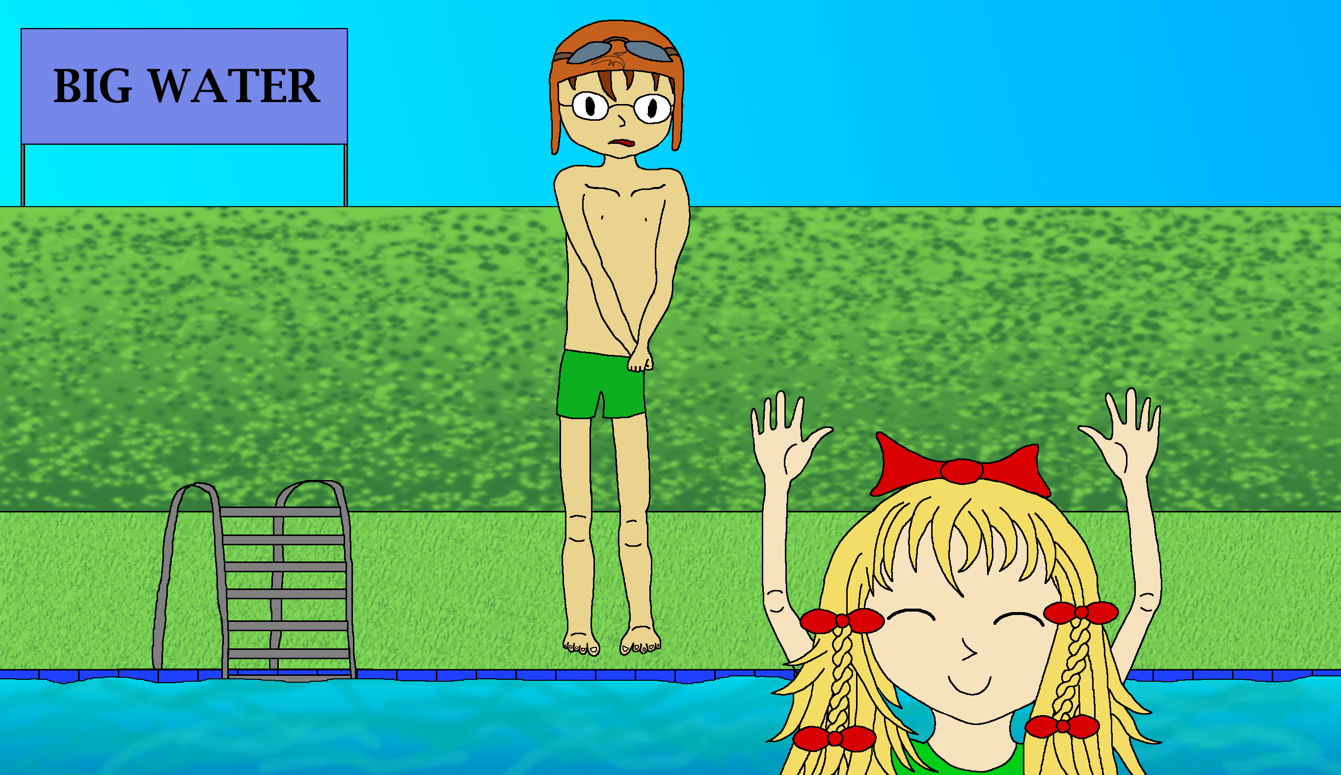
3. Ducky noticed that Petrie wasn't having any fun so she swam to the edge of the pool where Petrie was watching.

"Come in too, it is very refreshing, yes it is!" Ducky asked sweetly.


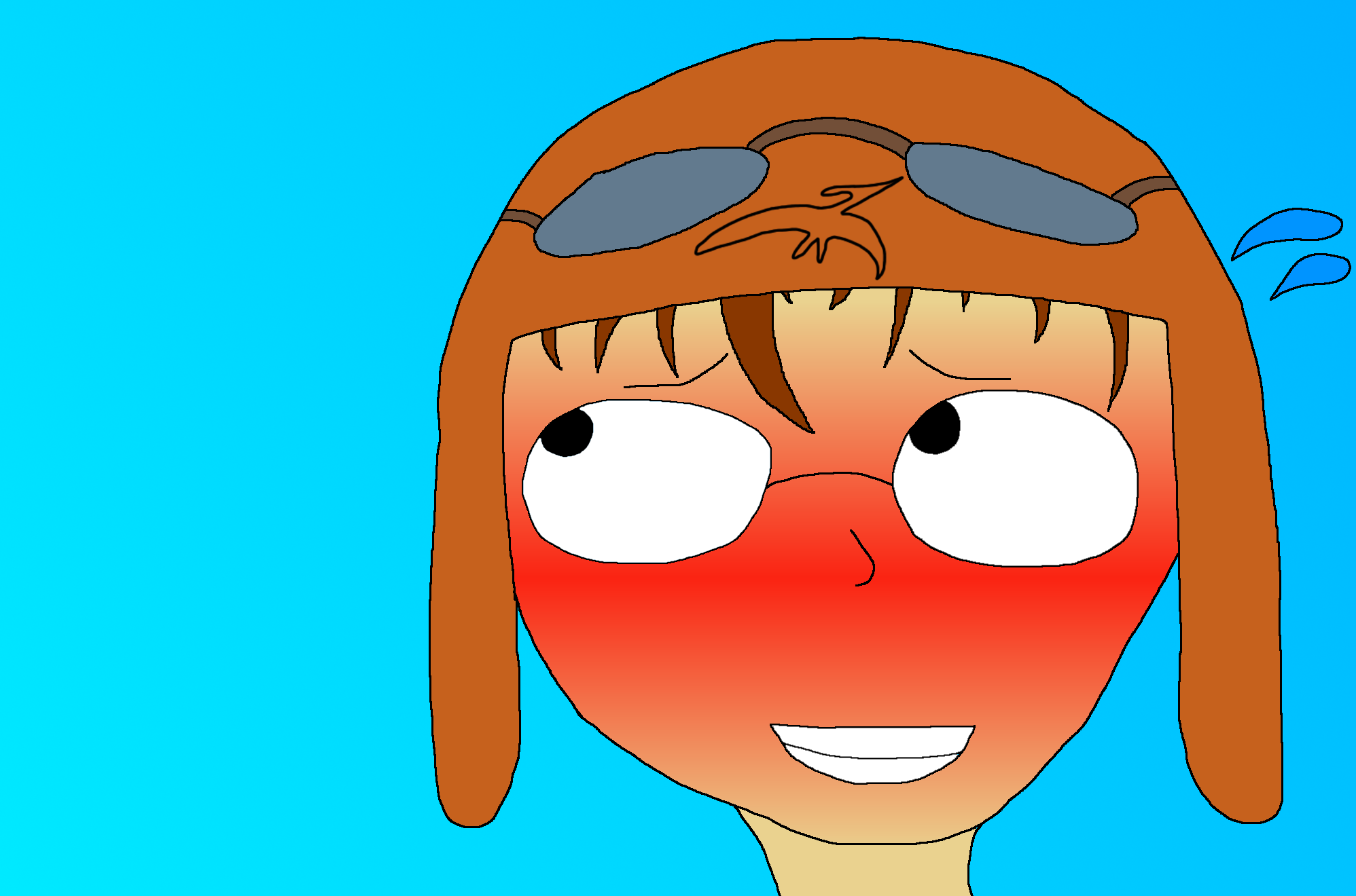
4. Petrie really wanted to join Ducky who he happened to have a slight crush on so the thought was mildly embarrassing, especially since she started climbing out of the water to get up close. If only there wasn't this tiny little problem…

"Me would love to but… Me no can swim…"


5. Ducky wouldn't give in so easily though and a solution was quickly found.

"You can have my pink floating ring so you do not have to worry about going under."

Petrie didn't seem too keen at first so Ducky decided to use her most effective charm.

"Pweeeeeeaaaaaase?"


6. Resistance was futile; no one could say no when a cute girl was begging like that and it was no different for Petrie.

"Oh fine, me gonna go for a swim after all…"


7. Petrie quickly darted off to grab the ring and soon found himself playing happily with Ducky in the water. Water wasn't too bad when Petrie wasn't in danger of drowning and with adorable Ducky after all.

We split up work on these. What you see here is entirely LeventeII’s art, I did the character design and sketched the poses we were going to use as I have more experience with anime style and drawing humans (albeit it is far from being a lot of experience :lol ) but I’ll show one example of what kind of drawing I did in the background at the end :) I also had the leading role in the development of the story, I guess.

I have got some experiences with paint.net, an open source image editing software, which I use for all my digital artworks or projects like the Land Before Time map. Since it isn't as professional as commercial software, I was still optimistic that it wouldn't affect the end result. I was more worried about the fact that I've got no experiences in anime-style before. I had a plan from the beginning on how I would approach the digitization process though.

I was only able to use my mouse, which made things a bit more difficult because drawing with a mouse doesn’t work as elegant as with a pen.


Before the comic became a thing:

Our first obstacle was inexperience so I put together some tutorials I found on the internet and we did some basic practice like “how to draw anime faces” or “how to draw anime eyes” although we never ended up having enough time to finish the plan I made :D

I was able to use some free time during school (but also during lessons :p) to practice the basic shapes of a character. The tutorials which we watched were a great help on understanding the design and anatomy.
I already had an idea for the prompt in December, that's why I talked to Ducky about help, because I wanted to start working on the drawing. We used some aspects from this idea, as you are going to see.


Our second obstacle was, funnily enough, the abundance of ideas. What we’ve drawn is only one scene of many we considered during our brainstorming and even that idea changed many times during the creation process. I had a rather long comic with over 10 panels in mind for example. At least this means we still have many more ideas to work on in the future :yes

We decided to keep one of our first ideas: A scene with Ducky and Petrie in which two opposites come together: Air and Water. This idea led us to the comic idea and thus to the given pool-environment.


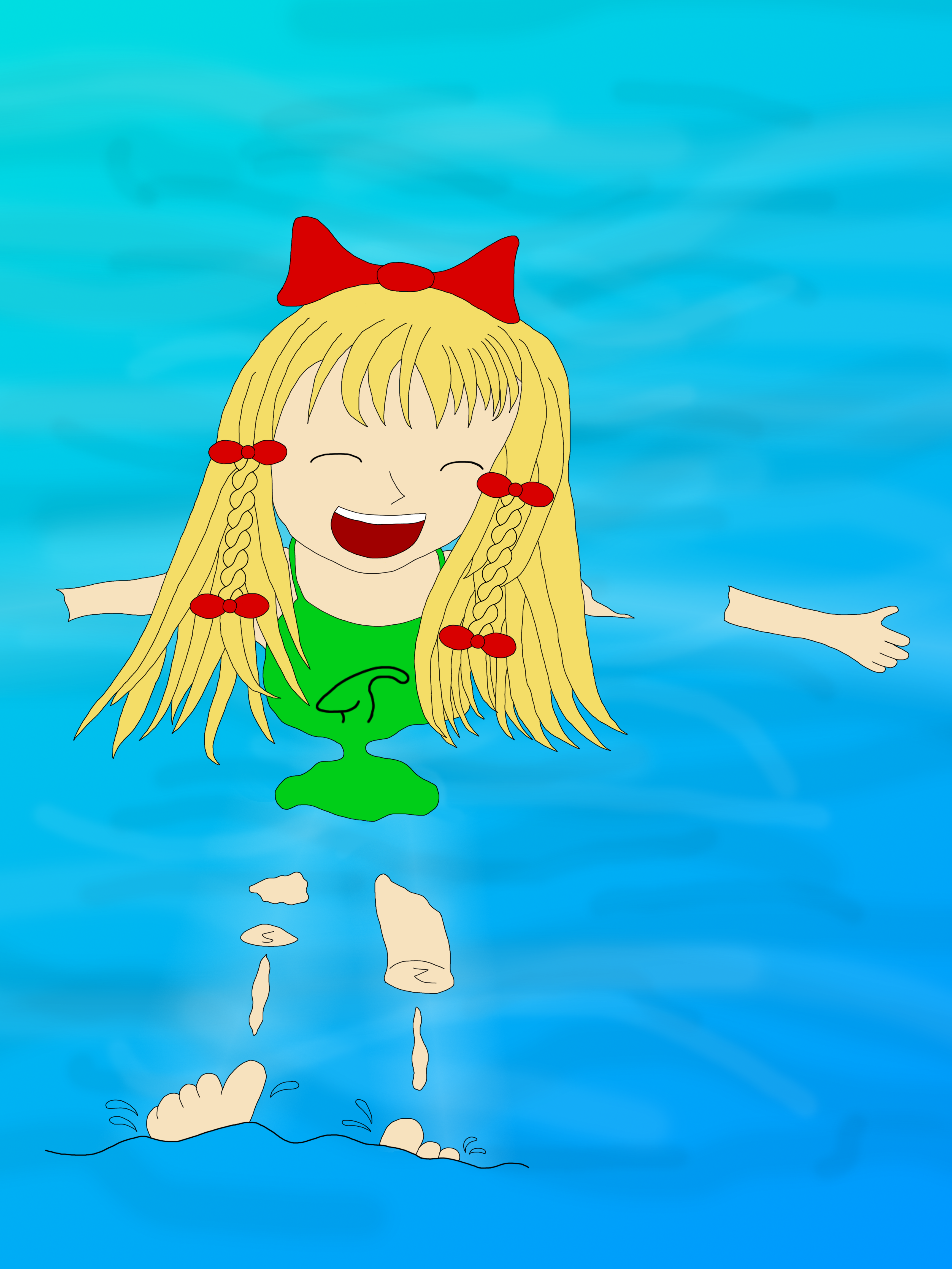
Panel 1:

It doesn’t contribute a lot but we simply had to include such a panel. I mean, Ducky being a swimmer would absolutely LOVE swimming even in human form, right? :lol At first, I tried to draw a side view of Ducky floating on the water but soon realized that it looked… odd :P A lot of hunting for references was done here but, eventually, I managed to pull it off and even managed to learn how to draw Ducky partly submerged :)littlefoot

This panel was the first one which I digitized, that means that I tried every technique which I knew to create a panel as good as possible. I decided to use Anti-aliasing for smoother lines. I had trouble with drawing hair in the beginning, but after a few tutorials and about one week practicing, I was able to draw hair quite well, at least if I think about my first attempts in drawing hair...

This was a very special panel, because it contains a lot of techniques and tricks which I never used before. I already mentioned the first one, Anti-Aliasing, which can be hard to use together with colored regions. I didn't think that coloring would become that time consuming! It costed about 10 hours to colorize the drawing, because I could just use the filling-tool. I had to determine the color-regions first.

The second specialty about this panel is that Ducky is partly submerged. It was our idea to draw her underwater-body-parts transparent because then the water would have looked clearer, but it was way too complicated to think about the underwater-parts.

The third specialty is the color-transition, namely the water in this panel. Never did I use this tool, I always thought it was useless, because it is somewhat hard to think about its potential. It actually just fills a marked region with a color-transition with two colors. I decided to try this tool, because the water looked very flat and boring with only one color.

The result was very satisfying and I also added some waves, which created great dynamics!

I decided not to use Anti-Aliasing in the following panels. It just wasn't worth the effort. It takes hours to colorize a bigger-sized image and the result is not that better. But this doesn't mean the other panels were easier to create!


Panel 2:

Petrie, unlike Ducky, is a flyer and thus not very good with water and swimming. This is the main point in this comic, actually. This panel was actually quite easy to do, especially Petrie.

Without Anti-aliasing, but with more color-transitions! I realized that this tool opens fantastic possibilities if it is used properly.
By the way, the number of layers which I used were that high that my number of 8GB RAM were almost reached. :DD


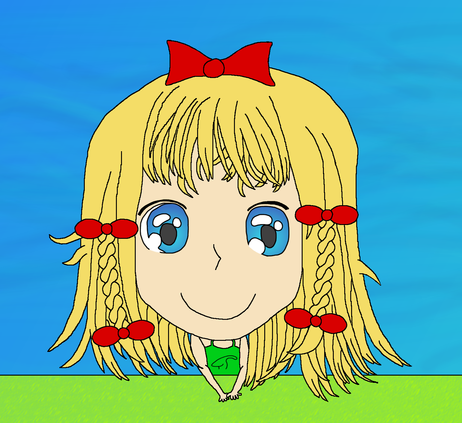
Panel 3:

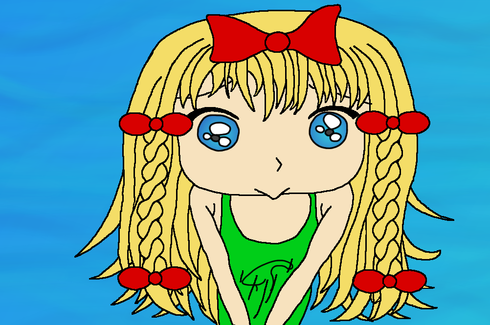
Excuse me for a moment but “D’aww, she’s friggin’ cute!” :wub This was my favourite panel to draw and I went all out while designing this. Also, I love the perspective here. Imagine that Petrie is looking down to be faced with this adorable face. Could you resist? I couldn’t :DD

As you are going to see, Ducky's given sketch was phenomenal! I was worried a bit that I may not be able to create a digital version of the same quality. But these worries weren't justified, because the outcome became pretty good. I really like the eyes. Oh! I did forget to mention that I still used Anti-aliasing for the eyes in every panel because I think that at least the eyes, which are a very important part in anime-style, have to be as qualitative as possible. I was willing to spend some hours into the eyes, and I think it wasn't wasted time!


Panel 4:

Petrie can’t resist but he also can’t swim. This is a problem! I had a huge block when approaching this panel and I think it mostly came down to the fact that I’m much better with girls than boys :angel

I swear, I spent an entire evening collecting and searching for images of blushing boys and in the end I didn’t use them because I was able to figure it out the day after, after remembering a scene from an anime where a boy blushes and used that as a reference. Way to waste an evening lol.


There isn't much else to say here. “What should I do?” :opetrie


Panel 5:

This one didn’t turn out quite the way I planned but we were running out of time so I refused to make any unnecessary changes. Ducky is pleading here, now Petrie absolutely cannot resist anymore. The power of cuteness, remember it! :duckysmile

This panel has got the lowest definition, that's why the lines seem bigger. Nothing else to add considering the digitization process. Only that this panel, even though being the smallest, required the most layers (16).


Panel 6:

Petrie gives in to Ducky and agrees to join her. My sketch for this took like 10 minutes to complete haha, was the quickest to do for me, especially since I found a good reference of the pose during my panel 4 search.

As you can imagine, this didn't take very long. Not because of laziness, but because of efficiency! And then our collaboration even became a name: #TeamEfficiency! Well, looks like not efficient enough to hit the deadline. :P

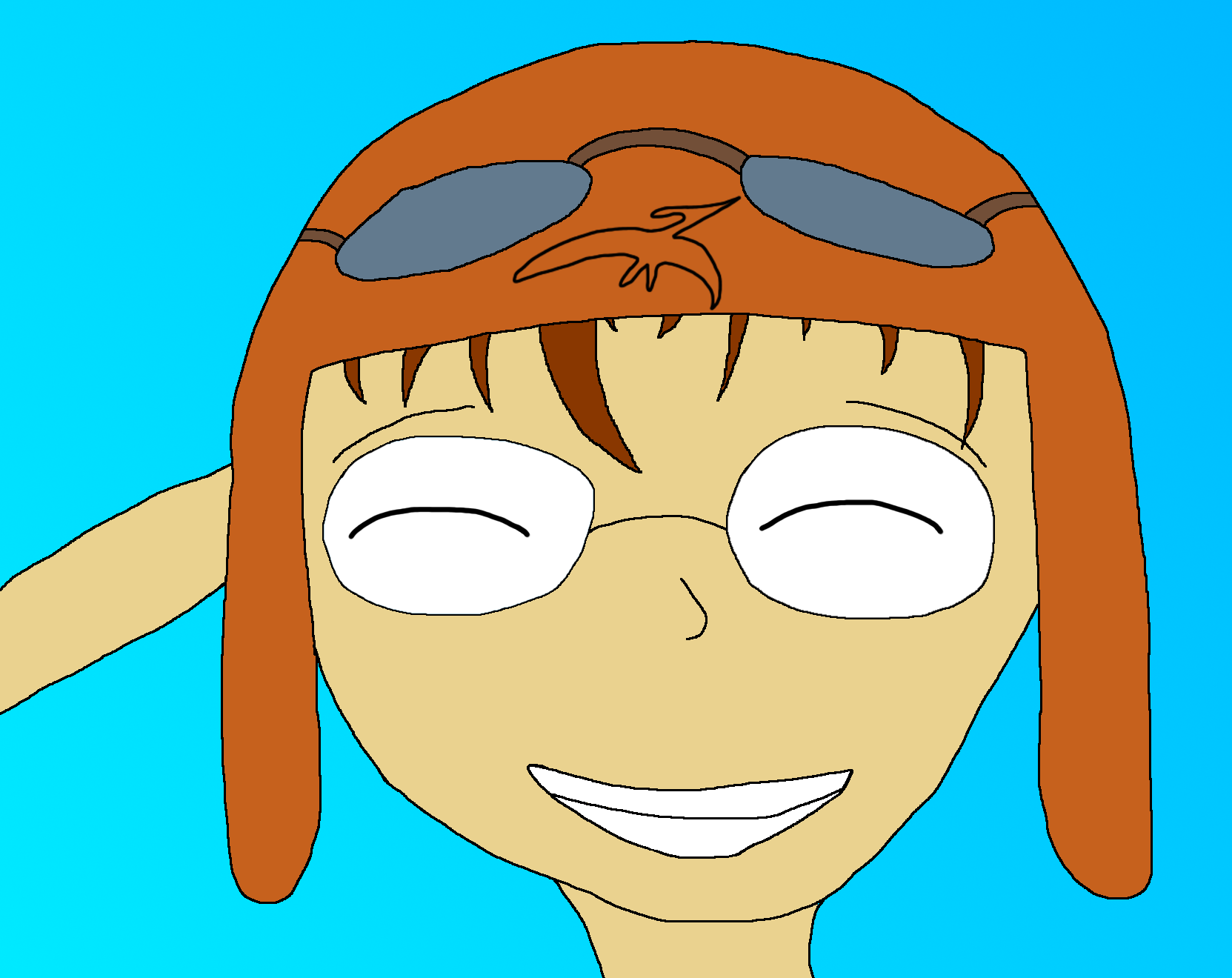
By the way, since Petrie is a flyer, I gave him an aviator hat. At first, it looked like a swimming cap, but then I covered his ears with the hat, and know it is looking as it should be.


Panel 7:

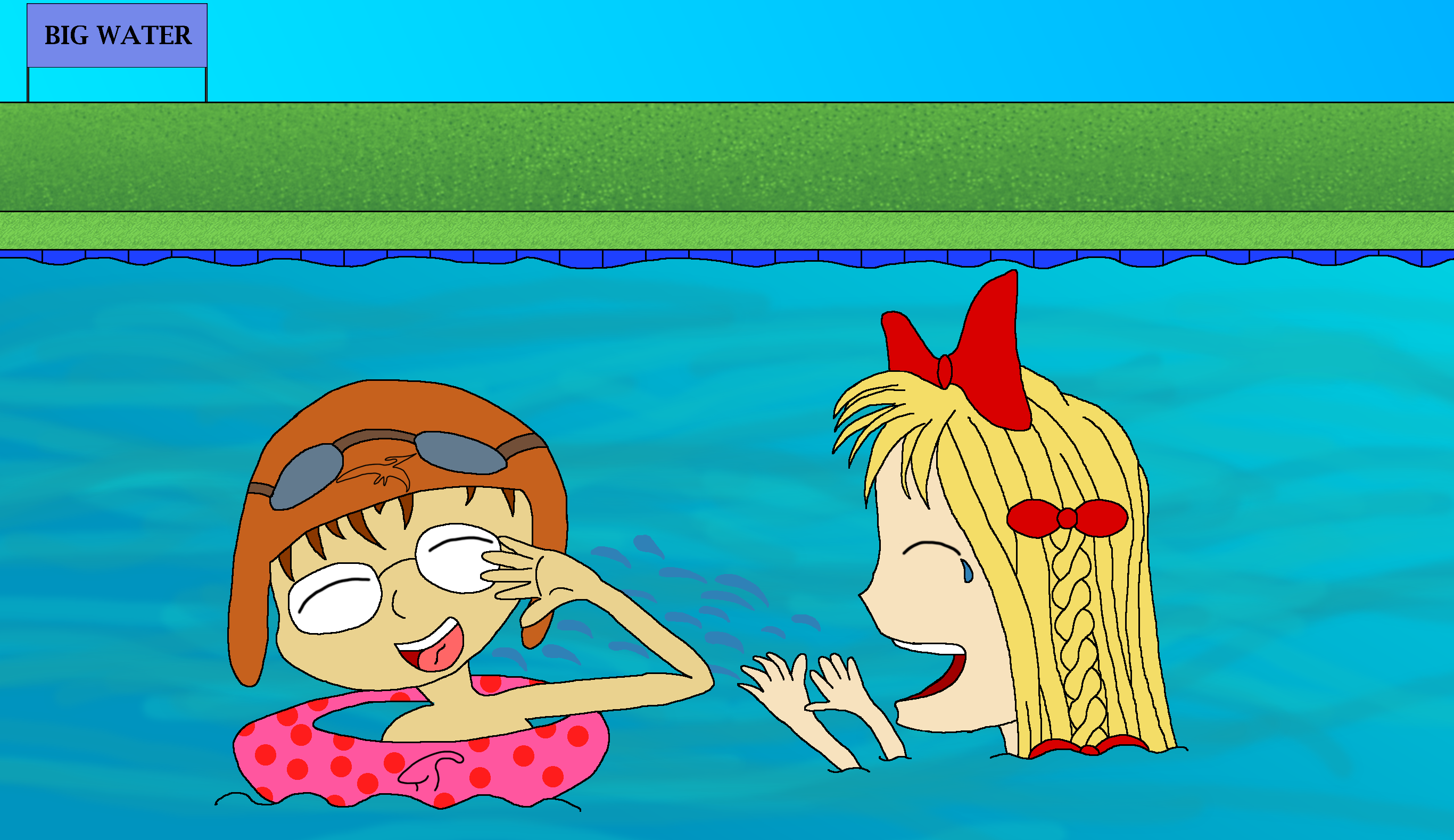
The great finale! At some point we were considering only drawing something like this, however it seemed a little boring and out of context so the comic idea was born, derived from and shortened from an even more extensive idea that I had. Finally, with some floating help (it belongs to Ducky, I think it's kind of obvious and at an earlier point we were going to draw Petrie embarrassed while using it but then again it felt bad to use the same expression and emotion more than once) Petrie joins Ducky and the two have a lot of fun :D

We had some last minute issues with the poses and stuff so they look a bit weird. We totally would have fixed it if there had been more time ;)


Oh yes, time was really pressuring us! I mean, we created this panel only yesterday! But we took our time, we even risked to destroy our (only partly working) sleeping schedule.

By the way, I didn't copy the background from panel 2, it just looks similar. I think this can be seen on the grass, but never mind. I tried a tool in this panel which I never used before. I knew it existed, but I didn't have any situation in which I would have needed it so far.

The tool I am talking about is responsible for Ducky's ribbon. I drew a front-view of a ribbon and then I “rotated” it. With some adjustments, I was able to save a lot of time because it would have been hard to draw the ribbon in this perspective at least a bit properly.


Notes about character design:

Ducky:

This comic only brushes the design of Ducky. Both of us were in agreement with each other about most of her features. The most notable thing is probably her adorable blonde hair and her rather cute face with big curious eyes. As for hairstyle, I actually do believe that Ducky would be someone to use a lot of different hair styles and play around with the vast possibilities long hair provides to a girl like her. For this comic series, I chose this open hair with small braids on each side and added some ribbons for some extra cuteness :) But, generally speaking, I do not wish to give her only one distinct hairstyle.

The second notable thing about her doesn't even come into play here. I do believe that Ducky is a dress|skirts person as it fits her overall cute image very well. I guess an one-piece for swimsuit is also more befitting of her than a bikini. We added the odd gimmick here and there but most of these were Levente's input :)


My image of Ducky as human, which I made in December, hasn't changed really. It was only a rough idea though. The hair, the clothes, all these things didn't become much different from what I was thinking about. Our ideas of Ducky weren't much different and therefore we were able to agree easily.


Petrie:

We didn't have a 100% matching image of Petrie but generally speaking we managed to find a good design we could both agree to :) I think the glasses and brown hair are obvious features that just scream "Petrie" if you ask me and those were things we agreed on readily. I gave him a rather round face too (I actually dunno why exactly, might be due to my image of him being derived from a character from an anime I like lol) but I still don't know exactly what eye-style he should have (we were always able to get around it with the expressions chosen xD). While I can draw girl's eyes rather well, boys are tough for me :angel

I think our biggest difference is that I didn't picture Petrie with a hat on his head. As for hairstyle, I also have it a little bit different than shown in the comics but those are compromises I was quite ready to make, yep yep yep :^^spike

Clothes would be rather casual or nerdy for Petrie, nothing fancy or the like.

 
Petrie's hat was one of the things which were instantly in my mind when I thought about an idea for this prompt. My view was that it would perfectly fit him as flyer. I imagine how he loves Airplanes and other aviation technology like balloons. Petrie's hat was,together with the “Big Water” sign, the only idea which I really wanted to include.


Future of this project:

This is just my personal opinion but I had a lot of fun doing the humanization project and I definitely learned a thing or two about poses, Anime style in general and, in particular, perspective as a few of these panels actually apply rather interesting and unusual perspectives. Having someone else to work with gives a whole different motivation and drove me to do a lot of work in the span of barely two weeks. Due to the vast amount of ideas we had (only using this swimming pool setting, mind you) I am positive that we will be able to draw more of these without the pressure of a deadline and perhaps with improving methods and experience :yes

At the very least, I wanna draw Littlefoot and Ali too LOL. Whether future projects will be joint projects or single pictures submitted by only one of us, we'll use this thread for our humanization concepts and drawings in the future, yep yep yep :)


This project was a great experience! It was very difficult sometimes and very frustrating, especially the fact that we just couldn't bring our pictures, which were in our mind, at the paper. but the positive feelings were much bigger! Not for a moment was I thinking about canceling the project. It was a lot of fun and and really worth the experience. It let me go deeper into the world of animes, and even watched my first series. I really felt the drawing process itself and I'm satisfied with the result and it was great to draw together!  :)littlefoot


Time taken:

For me, I'd probably say between 20 and 30 hours if we also count the many hours spent on coaching and researching poses and what not. I probably spent less than half of this time actually drawing :P

Since my task was it to digitize the comic, meaning visualize the ideas, it took a lot of time for me. Only the first panel itself took about 15 hours, but mainly because of the fact that it was the first panel and because it contains Anti-aliasing which needed enormous micro-managing. After that, ever panel had an average creating-time of about 4 hours, some less some more. Thus digitizing took about 39 hours. If one took the time of practicing and watching tutorials into that time, it would get over 70 hours easily. But it was fun, even if I didn't have much time left for other things  :lol

I am more than motivated to draw dinosaurs again, but I think I will keep on anime characters too! I wonder whether this project improved my drawing skills and how it affected my ability in drawing dinosaurs.  :)littlefoot


I hope you like our little project, please let us know what you think :)littlefoot


12
It's Party Time! / Re: Countdown
« on: January 23, 2020, 12:04:10 PM »
198

13
It's Party Time! / Re: Countdown
« on: January 19, 2020, 08:41:44 AM »
291

14
It's Party Time! / Re: Countdown
« on: January 18, 2020, 08:39:15 PM »
301

15
It's Party Time! / Re: Countdown
« on: January 18, 2020, 09:36:55 AM »
317

16
It's Party Time! / Re: Countdown
« on: January 17, 2020, 08:56:03 PM »
335

17
It's Party Time! / Re: Countdown
« on: January 17, 2020, 04:14:31 PM »
337

18
It's Party Time! / Re: Countdown
« on: January 16, 2020, 04:40:23 PM »
345

19
It's Party Time! / Re: Countdown
« on: January 12, 2020, 06:20:52 AM »
403

20
It's Party Time! / Re: Countdown
« on: January 12, 2020, 05:07:57 AM »
405

Pages: 1 2 3 ... 89