Thank you so much you guys. I was feeling pretty good about this one so I'm glad to see you guys enjoy it as well.

But maybe it's just for me. I say: if Ducky was better - I would call it masterpiece artwork! But still, now - I just love this!  Awesome job!
I find Ducky to be fairly difficult to get right. There's always something off whether it's the face, arms, or something else. This challenge makes her pretty fun to draw though, unlike the nightmare that Cera's frills bring with different perspectives.
(Do I see it right that her lower body is a little shifted because of the water? I mean like refraction of light)

You bet! That is indeed light refraction. I kept it more subtle as I wasn't sure how believable it would look. It's exciting that someone noticed a small detail like that. (If you're curious on how I did it I just simply drew her normally then drew a copy of the refracted parts slightly to the left. Once finished I just erased the original lines.)
I like throwing in small details like this when I can. The last prompt with Chomper's dad I included scars on his nose from the battle in LBT 5 but no one mentioned anything so I'm not sure if anyone noticed. (his head was also pretty tiny so it could've been hard to spot)
(except perhaps that straight line of trees in the distance which could have been a bit more detailed)
Is that what those are?

I honestly wasn't sure what to do with the more distant backgrounds. I had a row of tall grass closer up front so I just said screw it and did another row of that

One of the things I wanted to avoid was going crazy with the distant background details as I didn't want to have another last minute submission. I'll keep this in mind for next time though and try and meet more in the middle.
Ducky herself is done really nicely even if I get the feeling she could look a bit too tall here but I'm not really sure. Also, her tail is a bit too short .
Now that you bring up her tail I've done some looking into it and I think that the problem stems from the fact that it is pointing way more out to the side then it should and should be facing more facing "into" the page. Here is a rough mock up of what I'm talking about: (get ready for some math talk!)
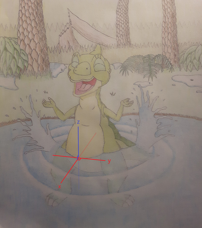
I superimposed the Cartesian coordinates at around the center of Ducky's belly along the water's surface (z = 0) and aligned the x-y plane so her belly is pointed at around the positive x-direction. The faint portion of the line denotes the negative x-direction, which would be right around the direction her tail should be pointed in. In terms of azimuthal angle (sweeping from x-axis counter clockwise) that would put it at 180 degrees. Right now it looks like it's somewhere at around 135 degrees. It's all approximate but I think it helps showcase the potential underlying problem.

 The forum should now be back up and running. Please don't hesitate to let us admins know if you run into any issues.